Thursday, December 30, 2010

What's My Purpose?

This is the first question I ask myself when starting a painting or drawing.  You can't make intelligent decisions on a painting until you've decided what you're trying to accomplish, and have some idea of how you're going to accomplish it.  That may sound simple, but there are several facets to this idea and you should be able to answer most of the questions below BEFORE you start drawing/painting:

Audience:  Who am I making this for?  Am I trying to make something that my audience feels more comfortable with, or something that feels more innovative and new?
Some audiences are inherently hard to please and have to be
won over.  Like hipsters, unless you're Wes Anderson.

Format:  How will the audience experience this image/character/environment/etc.?  Does the format affect the scope of what I can communicate?
Fringe's mad scientist is a great character that probably wouldn't work in a video game.
Or in a stand-alone illustration.  Internet images have a unique format problem also:
everybody sees them at a different size!

Purpose: What needs does this painting/character/environment need to fill?  Are there special or arbitrary parameters from the publisher/art director/marketing/writers/technicians/etc. that need to be included?
The house in UP had to function as an interior and exterior
environment, hold a storehouse of props, work as a vehicle,
and be something audiences came to care about as a symbol
for Carl's deceased wife.

Story (technically an extension of purpose): What role does this character/environment/etc. play in the property?  What emotional chord do I want to strike with the viewer?  Are there additional story/moodsetting things I could layer into the piece without distracting from the primary purpose/story?
Jack Sparrow's costume design is great---an iconic "first read," with lots of
suggested history in the details, yet all of it supports his personality
and the core idea of his character.  

Premise:  Which of the many ways of expressing the above purpose and story will feel most fresh and interesting to my audience?  Is there a way of integrating the publisher's/art director's/etc.'s parameters in a way that "feels right" or gives things an unexpected twist?

Let me reiterate what I said earlier but add something:  If you can't answer all of the above questions, DON'T START PAINTING UNTIL YOU CAN.  In fact, if you can't answer them in a way that makes you feel inspired about your illustration or whatever you're working on, I'd recommend that you either do some brainstorming or start over with a drawing that inspires some of these things!

Sunday, December 26, 2010

What does design have to do with painting?

As crazy as the version on the left seems, it's not far off from something I see fairly often:
thoughtlessly placed colors and values, ruining a perfectly fine drawing
Many of the students who take my painting class at BYU have limited training in painting.  Because of this, I expect to find a lot of structure or technique-related problems.  Surprisingly, while those other problems sometimes show up, the flaws that hurt students' paintings the most are usually design problems!

Some things I see all the time:
- A badly-designed drawing ruining what would otherwise be a fine painting
- Poorly-designed values resulting in visual chaos
- Unappealing renders of character designs that look great as drawings
- Ugly color schemes
- Workable color schemes ruined by poor distribution of colors
- Weak or confusing value/color composition
- Arbitrary or default decision-making, resulting in a generic image

While good structure and technique are essential up to a point, design seems to affect most whether or not a painting is successful and appealing.  The problem with design is that while the tenets are simple, the principles are so interconnected and expressive that there are endless ways to convey any single idea using completely different design principles. 

Because of this, implementing good design into painting isn't a simple thing to learn.  I've studied design a lot, yet I still struggle with some pretty basic things all the time.  I confess this is part of the reason why I want to do this series of posts.  If I can work through some of these complex ideas some more, maybe I'll get better.  If not, at least some of you will get a peek into how I think about art as I work.

Now that I've introduced the subject, we're going to dig into specifics.  We'll systematically break down each of the above subjects, in addition to some other things that are affected by design in painting: texture, silhouette, dimensionality, and communication of ideas or emotion.

Wednesday, December 15, 2010

Merry Christmas and Happy Holidays

Did this cover for the December issue of The Friend.  The next post on painting and design is taking a back seat to a bunch of other things going on right now, but I'll finish it up and post soon.

Wednesday, December 01, 2010

Epic Mickey

I did a little work for this game, for which I will never receive any credit (thanks Mr. Guy-Who-Messed-Up-The-Credits).  I did a bit of work on this project, but these are the pieces I was happiest with.  The line art/character design in the second one was by my talented coworker Jon Diesta.  Sadly, they went a different direction on that character in the final game.

Saturday, November 20, 2010

Why Design?

Design is, in a way, a derivative of something that makes humans unique---tools. Wheels, ovens, pens, iPhones; these are all things that allow us to shape the world around us and change the type of experience we have in it. Design is about making more effective tools---things that better serve the purpose for which they were made, and in a way that is most aesthetically pleasing to the user. I love design for this reason---it's purpose-driven and its results are measurable (satisfying my scientifically-oriented brain).

Because of this, instead of talking about the broader subject of what defines art, I'm going to assume that everyone buys into my philosophy that a piece of art is only "good" when it's successful in the goals it set out to accomplish. These goals could include expressing ideas, evoking emotion, and creating appeal or beauty. However, I'm also not going to talk about where good ideas come from, or about what qualifies as beautiful. Those might be interesting discussions for another time. What I want to talk about is the raw elements that effective art is constructed from.

Design is one of three major areas of study in art. These three areas are Structure, Technique, and Design. Very few artists have a mastery in all these areas, because there's a lifetime of learning in each one. Interestingly though, all three areas are closely related and rely on each other. Your character design of a horse won't be appealing if you don't base it on a real horse's structure. Design guides the use of brush techniques when painting. Some techniques for constructing the figure can speed up the process and produce more pleasing results. My Schoolism class is focused on structural learning (rendering surfaces accurately), but it ends up touching a little on design and technique because those things are inescapably tied to structure. Because of this, while I'm going to be talking a lot about design in the upcoming posts, keep structure and technique in mind because many of the principles will apply in both of those areas as well.

Next Post: What does Painting have to do with Design?

Wednesday, November 17, 2010

Design and Painting

Since most of my artwork these days is stuff I can't post, I'm thinking of doing a series of posts instead where I condense down the workshop I did at LAAFA on Painting and Design.  Will any of you out there read it if I do?

Tuesday, October 26, 2010

Environment

Considering how much I love doing environments, it's strange that I don't do them more often.  They do take a lot of time and they never turn out as good as I imagined, so maybe that's why.
I started this one for fun, then decided to keep the riverbed dry so I could use it as a base for one of the Schoolism assignments (the one on water and liquid, I'm having students paint water into the scene).

Monday, October 18, 2010

The Secret Life of Ms. Finkleman

I just noticed the a book I did a cover for last year has been released!  Working with Harper Collins was fun.  Probably the hardest part for me was hitting the right look for the target audience, as I don't exactly have a thumb on the pulse of the "tween" fiction market.  So I just went for something more realistic than my usual, but that still had some fun and imagination to it.  In retrospect I should have hired some models instead of trying to work out of my head, but I still wouldn't want to lose that that slightly skewed, almost carictured look.
I read an early draft of the book before starting the illustration, and I enjoyed it in spite of my out-of-touch-ness.  If you want a copy, you can see it here.

Friday, October 08, 2010

Drawing Session

I think this one was around 70-80 minutes.  I didn't do a good job with the likeness, but I'm happy with everything else.

Wednesday, September 29, 2010

LAAFA long workshop (Starting Friday!)

If anyone is thinking of signing up for this at the last minute, I thought I'd send out a quick clarification on what you're supposed to bring.
Bring some line art you're happy with and feel comfortable turning into a painting.
Bring a painting that you would like critiqued.
And if you have a laptop, tablet, or ipad you can paint on in-class, bring that also.  This one's not necessary so don't sweat it if you don't have anything.

Heading off to LA soon, see some of you there!

Friday, September 24, 2010

Lines

Here's some line art I did recently for the students of my BYU class.  I'm trying to give us more time for painting, so we're not spending as much time critiquing and fixing drawing issues.  We'll see after this semester whether it turns out to be a good idea or not.

I haven't had time to clean up the lines very well yet, and there are a couple more characters I'll post after I've fixed a few more things.  It's possible we'll just spend the whole semester fixing my mistakes instead!

Friday, September 17, 2010

Wind Rider

This was for another lunch project.  The assignment on this one was flat black and white values, minimal line work.

It didn't take that long, but it was a really good design exercise.

Monday, September 13, 2010

LAAFA: Design in Concept Painting

To be fair to. . .well, everyone, I'm not good enough to deserve teaching anything at this school.

That said, I'm going to do a 3-day workshop for the Los Angeles Academy of Figurative Art on digital painting and design in concept art.  This is my favorite subject of all, and I'm excited to get a chance to show attendees the real reason why I love painting.

Learning how to render form and light are essential foundation skills, but nobody becomes a great painter without a strong understanding or deep-seated sense of design in everything they do.  This is the most advanced class I know how to teach, and I'll be giving away every secret I know for using digital painting to transform a good concept into something really exciting.

I'll also be doing a demonstration for a few hours one of the evenings. This will be like a condensed and less-deep version of the 3-day workshop.

I hope some of you can make it!

Friday, September 03, 2010

Yellow or blue

Some of the people I work with are doing "lunch projects," where we use whatever time we don't spend eating during the lunch hour working on an assignment.  I won't post mine every week, because it's mostly an educational exercise, but occasionally something good might come out of it.  This week's assignment was to do something based off a palette from a Gustav Klimt painting.

Monday, August 30, 2010

Schoolism Class: Advanced Lighting

There are already a lot of other online tutorials on lighting and surface.  Not only that, but Schoolism has some amazing artists and instructors.  Because of this, I felt pretty intimidated when I was asked to teach a class for Schoolism.  I wasn't sure what I could bring to the table that would be on par with their other classes and worth the investment compared to similar offerings elsewhere.

However, after doing some work on the course I can say with confidence that this class is going to be awesome (if you don't mind my awkward way with words in the lectures).  I've done enormous amounts of research and boiled it all down in a way that anyone should be able to understand.  I'm excited to teach when the class starts up next month.  The part I'm looking forward to most is the interaction with students on the assignments, because that's where most of the learning is going to happen.

I did this as a demo from the lecture on "fleshy" materials.

Sunday, August 08, 2010

Something from Friday's drawing session

For some reason I liked this painting a lot better on Friday.  Now something seems off about it.  Maybe I didn't push the exaggeration enough.  Hmmm.

Monday, July 19, 2010

Comic Con: Schoolism and LAAFA Booths

If you want to find me at ComiCon, I'm going to be giving live critiques at the Schoolism booth (#2042) twice a day on Thursday, Friday, and Saturday.  I'll be there from 12:20-1:15pm and 4:55-5:50pm.  I'm not going to be selling my books during those times though, so if you want one you'll want to catch me just after I finish.  I'll be in the booth primarily for giving critiques on people's art and promoting my upcoming class for Schoolism.  If you're curious about the class, it's going to be an in-depth course on painting light and surface, and you can learn more about it on the Schoolism site.  I'd like to tell more about it but maybe I'll save that for another post.

I'm also going to do a painting demonstration at the LAAFA booth (#5562) on Friday from 2-4pm.  I'm doing a huge 3-day workshop there in October on digital painting and design.

So if you're coming to Comic-con, drop by one of these booths and say hello!

Friday, July 09, 2010

Book for Comic Con

I'm attending ComicCon for the first time this year, so I thought I'd better produce my first art book also.  It's filled with almost 80 pages of paintings and drawings, including old art, new art, and updated art.  I only printed 20 copies and I won't have a booth, so if you're interested you'll have to (A.) Go to comic-con, (B.) track me down, (C.) be one of the first 20 people to do so, and (D.) Have $30.
I will, however, be doing demonstrations at the Schoolism and LAAFA booths, so if you're wondering where to find me, I'll post a schedule of when I'll be at each booth soon. 

Here's a cropped sample from one of the new images in the book:
Hope to see some of you there!

Tuesday, June 22, 2010

Beak Mountain update

I haven't had much time recently to work on my own projects, but I want to thank everyone who gave critiques on the mountain picture.  Here's a progress shot to show that I'm attempting to address the various problems that many of you pointed out.  I haven't gotten to everything yet, so don't worry too much if you see something awry still.  For those who suggested that it needs a story, you're right (Curses! Why do I never think of basic rules like that until I'm deep into the painting phase?).  Still, I don't feel too bad since that wasn't the point of the piece; it will still work just fine as the painting process tutorial I wanted to make.
In other mountain-related news, I took my family up into a nearby canyon (about 30 minutes from my house) for a campfire/picnic last night.  Here's one of the views we had from our campground---although a photo doesn't give a very good idea of how impressive these mountains really are in person.
Also, if you haven't ever had wood-roasted hot dogs and s'mores, you need to find a way to make it happen.  Even if that means setting a fire in a dumpster and cooking before the fire department arrives [common sense alert for anyone who has none: DO NOT REALLY FOLLOW SAM'S ADVICE.] (<---Actually, this is not a bad mantra to live by).

Wednesday, June 16, 2010

Costume designs

I've been sketching with pencil and paper a lot more lately, and trying to get some of the rust off.  Unfortunately, I'm not confident enough yet to break the inks out, so these were inked and colored digitally.
As a side note, I've noticed that it's very difficult to design costumes that look good regardless of what the character is doing. Still, I've found I get the best results with a fairly straightforward stance pose.

Saturday, June 05, 2010

Shadows

Did this for a Liahona article.  The printed version I saw had different colors and lots of pixelation, so I don't know what went wrong (probably something on my end).  At any rate, now you can see what it was meant to look like:

Tuesday, May 25, 2010

Work-in-Progress

Something I'm working on, but I'm unhappy with something I can't quite put my finger on.  Any suggestions/critiques?

Thursday, May 13, 2010

Book Cover

A cover I did for a German publishing company.  The book is a compilation of two previously published books by A. Lee Martinez.

Tuesday, May 04, 2010

Old man and tablet

I use an old Intuos 2 at home and the pen is falling apart.  I hate it.  I'm counting the number of times that the button falls off and the sleeve falls down before I get fed up enough to spend money on either A) a new pen or B) a new tablet altogether.  I hate to spend $70 on a stupid pen, but I'm having an equally hard time justifying the much larger expense of the tablet.

I do like the Intuos 4 though.  I spent about 10 minutes scratching out this color sketch on a coworker's new intuos 4, and then spent another 20 minutes polishing it up on my rickety tablet at home.  The quality difference between the two was pretty big, but I have to weigh that factor against how cheap I am.  So at least for now, cheapness wins.

Tuesday, April 27, 2010

Orangutans and Character Design

Character design has always been a struggle for me.  When I was at BYU several years ago, I was so bad that I had to take Ryan Woodward's excellent character design class twice.  One assignment was to make characters based on animals, and the first time I tried an orangutan.  The result was so unappealing that I hate myself for having to post it:
I realize now that my problem wasn't my skill or lack thereof; it was a lack of knowledge, and more importantly, purpose.  All I did then was try to find a funny way to abstract the shapes that an orangutan was made out of, with maybe a little caricature.  What I needed to do instead to come up with a better design was have a more solid concept of who and what that character was supposed to be.  When you don't know anything about your character, it's hard to determine what kind of lines, shapes, proportions, or anything else to use to describe that character.  So what you end up with is a hodgepodge of decisions that don't lead the viewer toward any conclusions, which usually results in a less appealing character just because the chances of finding a great combination of elements at random aren't very high.
Armed with this knowledge, I decided to attack the problem again.  The lower left guy (image below) is where I started after doing some research on orangutans.  When I started to think about character types that fit with orangutans, my first thought was stereotypical surfers/hippies.  Then it hit me: Orangutans are the rednecks of the primate world.  So I did some more brainstorming and came up with a more specific personality/role that I liked for this orangutan.  My top drawings are starting to go somewhere.  If I was doing this character design for work I'd probably do about 20 more iterations to improve the idea and replace (where possible) stereotypical elements with more surprising ideas that filled the same purpose.  I already think the new guy (upper left) is a big improvement on the original, though.

Saturday, April 17, 2010

Tetrigid Tank

Something for the Avalanche blog.  Joe Olson came up with the topic. Honestly, at first it didn't really inspire me, but after mulling over the idea this idea popped into my head.  That's the great thing about committing yourself to do art based on topics---trying to find an interesting take on a topic that isn't (at first) interesting to you is a healthy challenge for your creativity.  I also like the idea of taking the challenge seriously and making it into a portfolio piece.  Although I do wish I'd spend a little more time on the bug's design before starting the painting.  The details are cool, but the overall structure is basically a regular old grasshopper.

Monday, April 12, 2010

Brush work

Here's the original drawing I did of the grumpy jedi before Jason Kim helped me fix the drawing.  Jason's suggestions made for a much better drawing, but I still think I slightly prefer the original character design.
In case you're curious about what brush I used, I just did a brush tutorial over on the art center blog.  This means that I will be as grumpy as this guy if I get any more people asking me what brushes I use.

Tuesday, April 06, 2010

Colored Frog

Used for another process tutorial on the art center blog.
EDIT: Added some more transparency to his throat.  I can't decide which is better.  What do you think?

Monday, April 05, 2010

Light Frog

Something I'm working on for a tutorial about placement of lights.  I don't know yet whether the tutorial will make it onto the internet, but I can at least show the art.

Tuesday, March 30, 2010

Finished (maybe)

I also added another tutorial on how I got it to this point.  Don't worry, I haven't abandoned doing tutorials on this site, in fact I've got one in the works that should be done in a few days.

Tuesday, March 23, 2010

Wednesday, February 24, 2010

Lights and Shadow

I added a new post on The Art Center blog.  What I left out there was how to apply light sources to get the effects you want.  This is just an overview, but I'll probably go more into depth on it if I ever write that blasted book.

Diffuse light sources are the most common and useful lights in painting. They make great fill lights, rim lights, and key lights, they always make subjects look appealing.  They tend to soften features and are good for creating a pensive emotional response when used as key lights.  Light reflected from "lambert surfaces" always fits into this category.


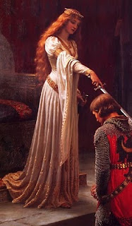
I didn't have time to paint examples and the great masters are better at it, so instead here's Edmund Blair Leighton above, using a bright overcast sky to support the gentleness of the scene.  William Bouguereau's painting below that uses the common "north light" from a window to soften the girl's features and emphasize her beauty.

Direct or spot lights have a strong visual impact and are useful for creating drama or tension.  You can mix the effects of direct light sources with the effect of diffuse light sources by using light sources that are somewhere in between.  Here's a great example from Paul Delaroche of the drama created by a direct light source.  Below that, Edmund Blair Leighton shows how a diffuse light can have some of the dramatic effect of a direct light, in this case by using a large window but positioning it some distance behind the subject.
Remember that spot lights are really just direct sources with something "off camera" casting a shadow, so the light beam has a specific shape to it.  This shape doesn't always have a hard edge, a great example being sunlight blocked by soft-edged clouds (see Albert Bierstadt example below, on the rocks).  So you can also mix the softening effects and gradients you'd get from a diffuse source with the hard shadows of a direct source.


Finally, nearby light sources are the most dramatic of all, but they can also be distracting if too strong or used too often, because of the visual tension they create.  I also forgot to explain another thing about them on the other site, so I'll post it here instead.