Some of my work from the class was pretty terrible, but I'll share some of my favorite things.
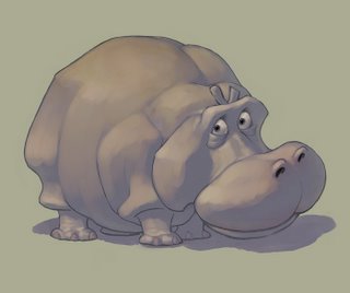
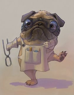
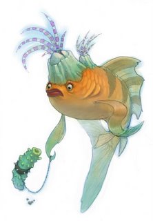
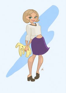
In one section of the class Ryan made us attempt to imitate several artists' styles on our own character designs. I think this part had the most profound effect on my thinking about character design and style. I really screwed it up with the Claire Wendling imitation, but I'm pretty happy with my Shane Glines and Alessandro(sp?) Barbucci designs. But I'm not going to even post the abomination that came out of the Mike Mignola attempt.
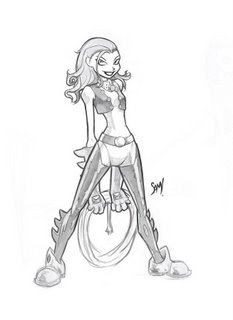


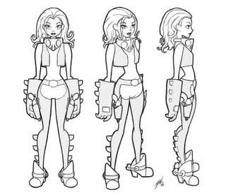
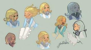
The final assignment was to take a character design you had done earlier and make a 3-view turn-around of that character, make an expressions sheet for that character, and design 3 other characters from that world and style. I wish I had more time to make these designs really great, but I just didn't. But here they are anyway.


dude... your work reminds me of why i do this... thanks for posting these AMAZING peaces of art...
ReplyDelete