Sunday, December 30, 2007

Church drawings

For some reason, sometimes I have an easier time paying attention in church if I'm drawing. Maybe it keeps me from being fidgety, and I think I'm usually studying people's faces anyway and this gives me a way to channel that split focus so I can listen better.


These are done with ballpoint pen, and usually pretty hasty before the person moves, so that's why I never get down to their bodies.


Friday, December 21, 2007

More digital life painting

This started out as a caricature, then I reined it back in as I was painted---that's why there's so much proportional weirdness. I am happy with the colors, though. I think this was about 90 minutes


Also, I finished my last class at school, I'll be officially graduated in April. I feel like I should hand out cigars or something. Or was that for the baby?

Wednesday, November 28, 2007

Wednesday, November 21, 2007

Brownies

This was for the Avalanche blog again. I've always been bothered by the so-called species of "Brownies," because I like real brownies so much better. But if Brownies are all about eating brownies, maybe I can be okay with that.


Monday, November 12, 2007

The designs of Baz Reynolds have been a great inspiration to me, so I picked his style to do my final character for the design workshop. I think it looks like it's in his style when you haven't looked at his stuff for about a month or two.

Tuesday, November 06, 2007

Character design workshop

We've been doing a character design workshop at Avalanche, and it's been fun. Unfortunately, I've been in charge of organizing the workshop presentations and critiques, so I haven't had as much time to work on my own drawings for it. We've got one more assignment to finish up, but here's what I've got so far: (My first design in the upper left)


Thursday, October 25, 2007

RANT of the Week: STYLE

After many conversations with artists about the merits of style in art, I believe that a misconception exists among many artists: the idea that “realism” is outside the realm of style. Most designers I've known tend to categorize designs as either realistic or stylized.

The truth of the matter is that any type of art, no matter how realistic, is only approximating what we see in reality. As artists, we’re interpreting two-dimensionally the response that our eyes and brains have to what we see in life. Images that approximate three-dimensional distance, perceived color, lighting exposure, and visual organization, are really using stylistic modes of representation (like perspective) to approximate a complex visual experience.

This is why I believe there's no such category as "realism" in art. Everything is stylized. Even photos or movies contain only a fraction of the information our eyes and brains unconsciously calculate and organize when we see something. Even the most "realistic" drawings and paintings are still stylized representations of what we see.

Just to be clear, I don't think this means that attempting to give the audience a “realistic” experience is futile, but that we should approach it with this attitude: rather than believing wrongly that we are reaching the impossible goal of realism, we should design with the knowledge that no matter what, stylization of some sort will be the final result. Once an artist understands this, he may use his knowledge of design to manipulate what the audience sees and thereby control how the audience reacts.

Anyway, I'd like to hear what other people think about this idea. I'm still developing my art theories, so feel free to post comments in rebuttal if you see flaws in my arguments.

Tuesday, October 23, 2007

Water Nymph

Also for Don's class. This was a brushes assignment: I was supposed to create some new brushes and paint a picture using them. I wanted to do something that was part Gustav Klimt, part Krista Huot. If you ever feel tempted to do the same, don't. It was a lot harder than I expected. I wanted to take it a lot farther, but I'm so tired of working on it now, I'm declaring it done.


Monday, October 15, 2007

Old Witch

Originally this was an assignment for Don's class, but I was having so much fun with it that I thought it would make a good topic for the Avalanche blog. I feel like the colors and values could still use a bit of work, but I'm very happy with her owl-old lady design and the gnarly hands.

Monday, October 08, 2007

Friday drawing session

Trying something a little different with the model this time---a little more stylization re-posing to bring out a more design-oriented drawing than usual.

Tuesday, October 02, 2007

Stone Golem

Did this for a paper texture assignment for Don's class. I'm happy with most of it, but the mud could be better. It was still a good learning experience, though.

Friday, September 21, 2007

Avalanche drawing session

I decided to work on improving my use of color, so I've started bringing my laptop to the live drawing session on Fridays. Doing a caricature from life is, in some ways, easier than doing it from a photo. However, translating the colors and lighting from what I saw to the computer was more difficult. I'm happy with what came out, though.

Thursday, September 13, 2007

Moody

I'm taking Don Seegmiller's digital painting class, in the hopes that I might be able to break out of my characteristic way of painting and vary up my style a little bit. I tried doing this guy with completely new brushes, mainly Painter's loaded palette knife. I did this during class, and at BYU they've got Cintiq tablets hooked up to Macs, two things I'm not familiar with. Maybe it was just too many new factors, because I found myself unconsciously muscling the brush into the role I wanted it to fill, resulting in a technique that looks very much like just about everything else I do. Hrmph. Oh well, the semester's just started.


Wednesday, September 12, 2007

Elf+Magic+Fairy+Girl=Normal

Another one for the "Bad Fantasy Art" challenge on the Avalanche Blog. I wanted to make a design that poked fun at the stupidity (both in concept and intelligence) of the standard female fantasy character. However, I didn't get the chance to take it as far as I would have liked. That big round loopy shape in the background was originally a dragon looking up at her, but I ran out of time and patience. Someone suggested I should have also made her a "furry," half-cat-half-human, decked in revealing armor, but I wasn't sure I could paint that and still retain my sense of dignity.

Tuesday, September 04, 2007

New avatar


I stuck with the pug merely to keep a tradition. It's not that I have an obsession with pugs---I don't plan to even own a dog, ever. But there is something about their goblin-ey faces that I really like to draw.


Here's the full version.


Wednesday, August 29, 2007

Personality: Angry

I'm not sure which is sadder: that a few years ago I would have drawn a character like this in all seriousness, or that his sword really isn't that big compared to the average japanese video game.


Done for the "Bad Fantasy Art" topic on the Avalanche blog.


Thursday, August 23, 2007

More bus drawings

One of these times I'm going to draw more than the head and shoulders, you just wait and see.

Wednesday, August 22, 2007

Wanted in the Wild West

A couple quick pictures I did for the latest Avalanche blog topic. I realize now that it should be Lucky Lucy. Duh.


Monday, August 13, 2007

Doctor Von Auch

I made this for a presentation I did on character design. The presentation was about an appoach to character design I've been developing for a while now, with the help of others at Avalanche like Todd Harris. For the presentation, I took people through the steps of making a character appealing for a specific audience and purpose.

I decided to take an old drawing of a torture specialist and try to make him appealing to a 7 to 9-year-old audience (fun!). I picked this drawing because it's not necessarily a bad drawing, and he might even be appealing to an older audience---but the point of my presentation was to emphasize that design is different than drawing and that appeal is subjective depending on the audience.

So in order to make this guy more appealing to a mixed 7-9-yr-old audience, I made up a backstory that he used to have a medical practice, but he went out of business because his patients were creeped out due to his hairless condition. He picked up the torture gig on the side just to make money, but unfortunately discovered his latent fear of needles and a tendency to faint at the sight of blood. Then with the audience and this personality in mind, I essentially applied various design principles to him and he sort of evolved naturally.

This is the beginning character (left) and the end result (right). Ask your 7-year-old daughter or nephew which one she or he likes better so I can find out if I was successful.

Tuesday, July 31, 2007

Level 25 Construction Worker

After seeing Adam Ford's, Ryan Wood's, and Dave Malan's version of this guy, I got to thinking how many different ways you could color the same picture, and I couldn't rest until I did one that felt different. I think maybe it turned out too different, this time around.


Thanks to Joe Olson for the awesome line art.

Thursday, July 26, 2007

Sorry, but yet another caricature

I did this for the Avalanche topic as well as for a workshop series by Dave McClellan. This one combined value with saturation, so we could work with the effects of warm/cool relationships.

Monday, July 23, 2007

Lazy caricature

This girl was funny, always stretching her lips out and adjusting her face, like she was afraid still that her mouth would get stuck in one expression if she held it long enough. Or maybe it's that super-self-conscious model mindset. Either way, it was hard to do her face.


I generally hate the big-head-small-body type of caricature, and that's how this one ended up looking, so boo to me. I fuzzed out the terrible body I did though, so at least you don't have to deal with that part.

Monday, July 16, 2007

Friday drawing session

Avalanche has a figure drawing session every Friday, but I'm not an accomplished figure drawer, so I don't often spend much time in there. I guess I'm uncomfortable drawing around all the people here who can whip out amazing figure drawing after amazing figure drawing. I'm lucky when I don't end up with some type of disproportional disaster. Still, it's good to exercise my drawing and design muscles. Sometimes I'll use the session to do a caricature or cartoon version of the model, which I think is useful in a different way. I was only in there for a few minutes this last Friday, so I focused on the head of this guy. It's hard to caricature someone who has the "model look," because their faces are so darn normal.

Thursday, July 12, 2007

Robohobo

I did this simultaneously for the Avalanche Blog topic and a workshop on value by Dave McClellan. I like killing two birds with one stone. Or at least maiming one while inflicting mild abrasions on the other.

Thursday, June 28, 2007

Fat fish

I realized I hadn't posted in a little while, so here's a quick fish to provide the illusion of productivity:

Friday, June 08, 2007

Hitmen

For the Avalanche blog, but I'm posting here also so it looks like I'm keeping this blog up to date.

Wednesday, May 30, 2007

Sorry for the wait

I've been out of town. Here's an Avalanche blog post. I think I keep painting things too dark though, because they always look wrong on my cruddy old monitor at home. Or maybe that's just because it's a cruddy old monitor.

Wednesday, May 09, 2007

Happy Demon

I wanted to spend a lot more time on this, but it's been a while since I posted last, so I got impatient.


Nothing is more evil than a magenta demon.


Wednesday, April 18, 2007

Meet the Robinsons game

I did some very early concept art for the game, none of which was used. It was fun to kick out some wild ideas of how things should be, though. Lots of this stuff was really quick because I knew it was very likely to be rejected. I'll make a couple more posts with it art for the game in days to come.


All images copyright Disney 2007.

Thursday, April 05, 2007

Thursday, March 29, 2007

More funny faces

Been busy this week, so sorry for the lame post. The first one is, in fact, a lady. She's the bus driver in the morning. I don't feel bad making fun of her, because she is the devil.

Friday, March 16, 2007

Funny faces

I want to start drawing from life more. It's fun, and feeds my brain with new ideas.


Here's a couple doodles of people from the bus, and a drawing of the model from my work's "drawing session" this morning. She had this funny grimace-smile that I wanted to capture.
The colors on the first one turned out awful because I started out trying to paint him in bluish light, but that failed so I changed it. I need to experiment with other types of lighting, though.


Wednesday, February 28, 2007

Appeal Rant Redux

Here's an example from my earlier post on Appeal. I talked about three things that influence the appeal of a design: Effective use of design principles, creativity, and attention to audience and purpose. Maybe not all three apply here, but it's still an okay example.
Both of these are the same assignment from the character design class : use a photo pose to create a character based on trees and plant life. I took the class twice, and this was one of the identical assignments (the first design=first time I took the class, second=second time) Which one is more appealing may be arguable to some, but in my mind the second has more appeal to it. I'll explain why below:


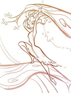
The first one isn't a bad drawing, or even that terrible of a design. But there are multiple reasons why it lacks the appeal that exists in the second one. First of all, I was only minimally conscious of the shapes and lines I was using---I think my major focus was on getting the linework to describe the details and form. Second, the use of space is much better in the second than the first. I think I was afraid to leave any open spaces in the character, because I was trying to describe bark and leaves and I thought I needed detail everywhere to do that.
I think I was also afraid to take some creative license with the photo reference---the proportions and pose are much more interesting in the second one. Turning the head makes a big difference since it's supposed to be a character design and not just an action drawing. That way I could put a little personality and interest into her face.
I think that being a little creative with the style helps the second one also. The first one is so straightforward and everything is presented as literally as possible. This goes into the third point I discussed earlier with appeal---I think with the second one I had a better idea of who my audience was (the teacher and students in the class) and I knew that putting a little style and flow into the lines would appeal to that group.
Looking at both of these drawings, it's clear to me now why I was so frustrated the first time I took the class. There are a lot of good things about the first design---but I think very few of those things were intentional. I can see that something was tickling at the edge of my mind. I had an inkling of what I was trying to accomplish, but I didn't have the tools yet.
Anyway, this is probably a pointless post, but hopefully it might help if there's someone in the same place I was when I was struggling through the character design class for the first time.