Tuesday, December 23, 2008

Fat Old Man

As a kid I wasn't sure what to think of Santa. I fully supported the idea of a magic guy that distributes presents in the middle of the night. Honestly, that act alone would make me think anyone was awesome. I think that's why I could turn a blind eye to his alleged violations of children's privacy, cookie engorgement, and kissing random kids' moms. And yet I couldn't help but feel nervous any time I was supposed to sit on his lap. Maybe I wasn't so okay with everything after all. Thanks Santa, I'll take the presents, but let's just keep our distance, okay?
Someone requested I post some work-in-progress versions of a painting, so here you go. I was also going to describe why I did things this way, also, but it didn't make any sense so I deleted it. Sorry.

Friday, December 12, 2008

Aquarius

I've heard people complain before about the accuracy of Wikipedia articles. Then when I did some research for the current Avalanche topic, I finally discovered what people are talking about. Wikipedia lies. Aquarius is some cool being of watery power, not some dumb urn-sloshing doofus. I am not in denial.


Thursday, November 27, 2008

Thanksgiving Villain

Happy Thanksgiving! This one isn't done, but I'm posting it anyway. Maybe it's the holiday spirit, but I'm actually glad I never had time to work on it: I have a good job that keeps me busy, and having a family beats being lonely and prolific any day. A few other things that I'm grateful for:

- Growing up in the 80's. I don't think you can comprehend that there was a time in history when people thought He-man was cool without having experienced it yourself.

- My polarized sunglasses, and the endless entertainment they provide as I'm driving because I can tilt my head side to side and make the sky disappear.

- Flour. Think about how many cookies there wouldn't be without that stuff.

- Words like, "pronto," e.g. "Get me two cups of flour, pronto!"

- British TV dramas based on books from the 1800s. Either they're good because they're really good (even if you're embarrassed to admit it), like the A&E Pride and Prejudice, or they're good because they're really bad, like the one my wife and I just watched: "Doctor Lydgate!" "Rosamond! I was just. . .er, looking for Mr. Chaucerberry." "Oh. He's gone to market." "Oh. Er. . .good day." *weeping* "Rosamond, what on earth is wrong?" "I'm so very sad, Dr. Lydgate. Is there never to be anything between us?" (He sweeps her into his arms and kisses her.) "Oh Dr. Lydgate, I'm so very happy!"

- Which brings up the another important thing to be thankful for: British accents. Without British accents Monty Python would be a miserable failure, and you wouldn't hear nearly as many condescending remarks about how much better the British version of "The Office" is. Also, a large portion of the United States believes European politics are superior because, as we have learned from BBC dramas, the entirety of Europe speaks in an English accent.

- Also, dental floss.

- Except when it is wielded by those ladies (hygienists?) that do all the cleaning at dentists. Ow.

Wednesday, November 12, 2008

Trippy

I just took my family on a several-day trip to southern California, the beach, and Disneyland. It was fun, but best of all, it was cheap---3 tanks of gas (hybrid), free Disneyland (compliments of work), hotel=wife's brother's house, parking fees at beach or in L.A., and picnic meals or food provided by my sister-in-law. I honestly think the whole trip only cost us a couple hundred dollars.
Aside from ornery kids, the drive is always one of my favorite parts of a trip. I especially like looking at the constantly-changing scenery.
I think I saw this scene, only more beautiful, driving through southern Utah and Arizona in the morning (we started driving before dawn). I started this from memory the next day on my laptop, but I haven't had the time to finish it off like I want to. I want to post something before people decide to never come back here, though, so here it is.

Thursday, October 30, 2008

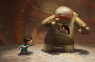
Pajama Gladiator Post-Mortem


Nicktoons Network has Pajama Gladiator posted up for a day so people can vote on it. Hurry and watch it before they take it down.

Things I did on the short:
- pitched the original story---a bit different from how it turned out, but I still feel happy that it was the project people picked
- worked with Joe Olson to do the majority of the character and environment pre-production art
- modeled the horned guy (didn't do the acid-purple surfaces)
- did surfaces for the "Cyclops" character in Renderman
- animated a couple scenes, including the "Cyclops freaks out scene" at the end of the battle

Things I learned from doing the short:
- No matter how much you contribute during pre-production or production, the folks that really matter are the post-production guys. This short never would have been done without those guys and they deserve all the credit in the world.
- The timing you get in the story boards/animatic is probably not tight enough for the final renders and animation. This thing felt really good at first, but now all I notice are the awkward gaps in the timing.
-Don't suggest a freeze-frame action montage unless you're willing to back it up with an example of how it should look. This is the most awkward part of the short, by far.
- Don't complain about the rigs on a student project, no matter how bad they are. Either help design them so they get them right, or shut up so you don't get the all-powerful rigging guy mad at you.
- It's hard to get people to see eye-to-eye on a group student project. Period.

In spite of all these problems, I think it turned out pretty good for a student short and I'm proud of it.

Friday, October 17, 2008

There's Always Room for Jell-O

Maybe I was an impressionable kid, but old Jell-O commercials seem to stand out as one of the most successful celebrity marketing schemes, ever. For me, Bill Cosby is still synonymous with Jell-O, even more so than his iconic role in The Cosby Show. If the world was taken over by jiggling jell-O people, our oceans filled with jello pudding and our trees replaced by pudding pops, Bill Cosby would be the rightful emperor of it all.

I did this for a themed party we had at our house tonight, "A Tribute to Jell-O." We're not Jell-O fanatics, it was just a funny idea my wife had when talking with some friends. Everyone was supposed to prepare a tribute to Jell-O, and we had everything from folk songs about heaving gelatin to autocad representations of favorite Jell-O recipes. This was my entry: a tribute to a unique dessert, and the man who gave Jell-O an unforgettable face.

Thursday, October 16, 2008

How practice makes. . .pretty good.

You'd think after designing characters professionally for years, things would start to come naturally, right? Well, you're. . .probably right, actually. But I'm too thick-headed to learn that fast.

I started with this great mental image of a warty-necked (pronounced nekk-ed) witch. I always expect that when I have a good mental picture, drawing it will be easy. Unfortunately, there's a disconnect between the picture my imagination thinks is cool and the drawing that my eyes have to reluctantly accept as the best I can do. I drew this character about 12 times before she started to look okay, at best.

A few positive lessons I learned, though:

- Drawing the same character over and over seems to always help

- I've created a brush that allows me to procrastinate design decisions until the image is nearly finished. There's nothing like reinforcing bad habits.

- Chicken scratch drawings can be forgiven if nobody ever knows they existed. Oh, whoops.

- Witch hats look stupid if they are blowing the opposite way of travel (maybe that's why my son drew his witch flying backward?) Apparently my kids already have a better grasp of physics than I do.

Monday, October 13, 2008

Which witch?

Halloween has always been a favorite holiday, not because of costumes or candy, but because of the excuse to draw pictures of witches, pumpkins, and other spooky things. I have fond memories of drawing halloween pictures with my brothers and sisters and taping them up all over the house. Because I had eight siblings the crayon drawings basically became our new wallpaper.
This year I felt the urge to draw a witch for old times' sake. As I worked my six-year-old son came over and watched, then went off and drew his own witch. His turned out better than mine, so I painted that one instead. I didn't get to polish it like I wanted, but I'll post it anyway. I want to encourage my kids so someday they'll wallpaper my own house with Halloween drawings.
A few things to notice in his drawing:
- She's either got one messed up broom, or she's showing off by riding backwards standing tiptoe.
- Loopy side shoelaces
- That face!
- Should she be lifting the lantern with telekinesis instead? Ring lanterns could tax the old phalanges over time.
- Ball hands!!!! My new goal is to design every character with ball hands and askew fingers.
- The blue light on the top of her hat (he insisted). I guess so other witches don't crash into her? What's the lantern for then?


Friday, October 10, 2008

Friday drawing

Yeah, nothing special today, but I haven't posted for almost a week. In other news, the other night I watched a show on the Discovery Channel called "Explosions Gone Wrong." I don't think that one even needs commentary.


Sunday, October 05, 2008

Monkey collaboration

My 3-year-old drew this monkey, and described to me the anatomy ("Dose are his kneees, and dose are his feet." "What are those four circles?" "His eaows." "He has four ears?" "Yess.").

So, I just had to make it a reality. I had to take a couple liberties, but for the most part it's pretty true to the source material. I'm also going to paint up a witch my 5-year-old drew, maybe in a couple days.

Friday, September 19, 2008

Lifey Drawey

Today our model was Chris Wingert of Real Salt Lake. Someone suggested that I shouldn't do caricatures of models that are capable of beating me up.
That means I'd never be able to do caricatures though, since most of the girl models could also take me down.

Friday, September 12, 2008

He-Man Characters

Adam Ford and others are working on some re-takes of He-Man characters, and they assigned me to re-draw Teela.

First of all, He-Man epitomizes everything I love about having been a kid in the 80's. We really, honestly thought this stuff was awesome. My brother and I watched the show religiously, and I remember the best Christmas when we both got He-Man toys. Of course, I think my older brother always got the good toys---my parents gave him Skeletor and He-Man, but I think I got Prince Adam and Cringer. I think my parents figured they could save a few bucks because I was two years younger and maybe wouldn't notice the difference. It's okay though, I was excited anyway. We even didn't care that they built a Castle Grayskull out of painted plywood instead of buying the real thing.

For all our love of the He-Man universe though, I can't for the life of me remember anything about Teela.

Maybe she was cool, who knows. But since I have no fond memories, I had no inhibitions about making fun of the things that are ridiculous about the way she looks. And that's a lot because this is a cartoon character from the 80's.
The first thing I noticed was, those thighs! Everything about her costume emphasizes the length and girth of her thighs, so that's what I pushed on, mostly. That and her uncomfortably thin 80's waist, the bronze(?) "armor," the fur lined boots, and, of course, that crazy hairdo. Yeah, this was fun.
I may even do another one, if the Guild of He-Man Re-drawers doesn't object.

Friday, September 05, 2008

Two completely different approaches to life drawing.

Sorry for the lack of posts this week, school started and I'm still trying to get on top of everything.

The girl is last Friday's effort, and the guy is from this morning.

Thursday, August 28, 2008

Snow Monster

Another one for the Avalanche blog. Someone just asked me where I got the idea from, and I told him it just came to me. What I didn't tell him that I breathed, slept, ate and drank Calvin and Hobbes throughout my entire childhood.

Sunday, August 24, 2008

Something different, but why?

I tried to abstract the figure in the drawing session on Friday, resulting in this sort of strange hybrid between cartoony and real. Even with all the things I changed, I was still sticking too close to the model.

I used to have teachers that would emphasize, "Draw what you SEE." But I can't help but feel like I need to break from that and draw what I percieve instead. Maybe that's what they were talking about? But when I just draw what I see, I end up with a cold, dead sculpture (sort of like this picture). What I feel like I ought to be doing is capturing the action and essence of what I see---not the literal measurements and forms, but the image that is alive in my brain. I keep trying to reinterpret the figure in these drawing sessions, but I'm just changing the forms and facts. What am I missing? Is it just in the pose? Magic?
I may not get it yet, but at least now I have a goal to accomplish.

Wednesday, August 20, 2008

Ice Cream

My wife tells me that for a blog named "Tasty Art," there are far too few tasty tidbits of actual food. So, I redirect my faithful readers to a recipe she made for homemade ice cream. It's very good, I think you should all try it.

So there you have it.


In honor of this actual-food-inspired post, I started a new picture. I was thinking of the Illustration Friday topic for this week,"Detach," so I might enter it there when I'm done.

*Edit*: Finished the picture and replaced it.

Friday, August 15, 2008

Cover, declared done

I'll probably make a few minor changes to this in a few days when it starts to bother me, but for now I've hit that wall of "I'm tired of working on this."

Yippy

Only had about 15 minutes to dedicate to the drawing session this morning, so this is what you get. Usually when I do these things I use col-erase pencils, and I've noticed that different colors have different ways of interacting with the paper. Vermillion is my current favorite (no, I'm not joking), because of the way you can layer it on top of itself almost endlessly to get darker and darker lines. Awful for shading, though.

Monday, August 04, 2008

Part 4: Recomposition and the Muddy Stage

I always hit this ugly point in a painting. All of my careful planning and thought appears to start unraveling at this point: I start seeing all sorts of new flaws in the image, like the problematic transition area between the ninjas and the pirates, and I begin to question my judgement.

Fortunately, experience tells me that the best way to get through this stage is to ignore the voices of discouragement and keep pressing forward. Sometimes the best thing to do is avoid the problem areas and continue with your favorite parts, waiting for inspiration to strike. Other times the best thing is to ask for help. This time, I'm going to do both. Help, anyone? What's bothering you and how should I fix it?

On a positive note, one decision I'm sure of now. That's whether the scene should be day or night. I started this out as a night scene, and I knew within about 15 minutes that it wouldn't work out. I initially agreed with everyone that said it should be night, but when I started painting it that way, I started to see all sorts of distracting problems caused by a relatively close spot light---particularly in how it spread the shadows over the figures. I think I'd have to start over and rethink the scene if I wanted the night thing to work. I'm glad people suggested night though, because I probably would have started with the day otherwise, but then always had a nagging doubt that maybe night would be better. Now I can move forward, knowing day is best.

That is, until Adam or someone else does a paintover and proves me embarrassingly wrong.

Wednesday, July 30, 2008

Part 3, Prancing Pirates

A very early progress shot of my revisions to the pirates.

I brought them closer together so they read as a unit and re-posed them so their limbs would create a sort of sunburst shape out from the Captain's head (but only as far as it felt natural).

I tried to make the characters feel stronger and more able, but also accentuated their differences in face and body type. I went a bit further with the caricature, so people hopefully won't be confused about whether the picture is supposed to be serious or not. I also think this will just make the image more fun, (even if it's just more fun for me to work on, you have to consider that as a factor too). I might find ways to simplify them more as I put color into them---just get them more streamlined so people aren't distracted by unnecessary details.

I'll talk about what I'm doing with the background and the ninjas in a later post. Right now, I'm tired and I'm going back to bed.

Also, you should stop typing without punctuation and capitalization. It makes you sound like a robot in my head when I read your sentences.

Wednesday, July 23, 2008

Part 2, or "What the crud is going on here?"

I'm starting to realize that I shouldn't have picked such a complex picture to start with. But like I said, I'm committed, so I'll stick with it and take it as far as I can.

The first question to ask yourself when doing a picture like this is, "Why am I doing it?" In my case, an art forum was having a drawing activity titled, "Pirates vs. Ninjas." Not a good enough reason to spend a lot of time on a picture, especially now that I'm going to spend MORE time on the it. I don't think I can get away from the fundamentally odd idea going on here without destroying the purpose of the "fix bad art" thingy, but I can try to make an image that has enough appeal to make people like looking at it even if they don't really understand it.

The second question is, what am I trying to communicate? At the time I only had a vague idea of something funny with singing pirates and confused ninjas, which is probably why the image is neither that funny, or really, all that clear either. So my new goal is, show why pirates are better than ninjas: musicality.

Now that I've got an answer to important question #2, it's time to figure out how to pull it off. I have a few ideas: 1-Emphasize the pirates, de-emphasize the ninjas. 2-Make the pirates look like they are having fun, and the ninjas are not. 3-Make the pirates look cooler, instead of a bunch of drama pansies (sorry to all drama pansies out there).

Third "question" (Not a question. More of an "issue."): Appropriate format and composition. This is the biggest problem with my original piece. I created a composition that would look great for a full-color image, but went with a completely wrong format. And since nobody who is not named Eric Canete should tackle a subject this complex in just black and white ink, I think I'll convert the image into a painting.

This has a lot of compositional problems to fix if I'm going to do a painting, but the first is value and lighting scheme (this will affect how I compose and design the characters and background, as you will see later). I did a few thumbnails to test a couple ideas.


Full daylight: pretty good, but the pirates really get lost against the bright background. Making the sky a darker blue might fix that problem, maybe.


Sunset: Very dramatic. But totally wrong for what I want to accomplish.


Night: Better than the other two, might work.


Day with modified background: Also good.


I'm having a hard time deciding between the last two. I even did a quick color pass for each to see if that sorted anything out:


The night scene is very theatrical, but the day scene allows for nice color. Chime in if you think I should go with one over the other.


Next post: Revising the character designs, and how writing sentences without capitalization or punctuation makes you sound like a robot.

Saturday, July 19, 2008

Fixing Old Art, Part 1

I keep resolving to post more, but the resolution barely survives past the post where I make the resolution. So, this time I'm going to commit myself to a series where I show how I would improve the cruddy art I did years ago.


Here's the image I'll start with, something weak from years, and years, and years ago. Or, 2003.


I know, some of you will look at this and think "What's wrong with it?" Others may be thinking, "Only five years ago you were doing this garbage?" To both parties I say, it's not really that bad, and some parts are working well, but it's both planned and finished poorly. We'll see in time whether my improvements will be actual improvements.


There, now I'm committed.


In other news, a couple months ago I got whooping cough. It's not as fun as it sounds, I haven't whooped once (I'm a little sad about that). I didn't go to the doctor until it was obvious something was really wrong with me, and although he gave me antibiotics, the damage was already done. Apparently, the coughing part of whooping cough can sometimes last for up to a year after the bacteria is dead. Unfortunately, the coughing part is a lot worse than you'd imagine---constant coughing fits, difficulty breathing, and in my case, a runny nose that makes the coughing worse. So when you're wooing your love interest over a plate of manicotti at Olive Garden, and some guy is coughing constantly in the next booth, messing up the romantic ambiance? Yeah, that's me. Sorry. Maybe it will help to think about how good my wife is for putting up with it all.

On a positive note: These days, two hours of uninterrupted sleep feels awesome, and I'm ecstatic every time the doctor finds a medication that gets my throat to relax, even if it means I have to use some kind of strange drug paraphanelia while I'm at work, closing my door and crouching in a corner with a guilty look on my face if anyone comes in to sate their curiosity. Anyway, it's nice how perspective can help your attitude, making you grateful for things like being able to breathe. And I can use the time I'm awake at night to work on posts for this blog.


The moral of the story: Get your booster shots. I think the Tetanus booster has a vaccine for whooping cough in it, and it lasts for about ten years.

Thursday, July 03, 2008

Work in Progress, Just for fun

It's been a week, so I figured I'd better post something. This isn't done yet, but at least it's something to look at.

Friday, June 27, 2008

Good drawing session

I'm pretty happy with how this one turned out, considering it only took an hour.

Friday, June 20, 2008

Grayscale

Thank goodness for the Avalanche drawing session---it's the only thing keeping me drawing things outside of regular work these days. This one is about an hour of work. I did a body too, but I thought the image worked better cropped.

Friday, June 13, 2008

Friday Painting

I wish I could post more, but I'm so busy at work right now. But here's something I did in our figure drawing session. It was meant to be a caricature, but I think I ended up normalizing him too much as I painted over the drawing.

Friday, May 30, 2008

Another quick caricature

From our figure drawing session. This one look closer to 15 minutes, then I spent a few adding in the highlights after I scanned it in.

Friday, May 16, 2008

Meager offering

Sorry for so few posts lately. I've been extremely busy at work, and we've been in the process of moving at home (we've actually been in the new house for a couple weeks now, but there are always so many projects after you move).

I could only dedicate ten minutes to the figure drawing session this morning, but the model had such an awesome face I just had to exaggerate it a little.


Friday, May 09, 2008

A tribute. . .

. . .to my favorite faces on our local NBA team. I wanted to spend more time refining the likenesses, but I decided I'd better finish it quick since the Jazz aren't looking so great against the Lakers right now. The players depicted here are (left to right) Carlos Boozer, Mehmet Okur, Andrei Kirilenko, and Deron Williams. I thought Deron's likeness would be easier to capture because he looks like a baby monkey, but he ended up being the hardest one---I'm still not happy with how he turned out.

Monday, April 14, 2008

Sunday, April 06, 2008

Friday, April 04, 2008

Friday drawing session

This one was turning out pretty good, I just ran out of time. This was about 90 minutes, all digital.


Friday, March 28, 2008

Drawing session and Ace in Action concept

I was experimenting with color in this morning's drawing session, but I could never get the skin tones to work quite right. I feel okay about the picture anyway, but just in case it's not enough I'll include some conceptual development from Chicken Little: Ace in Action. This was the original design for Abby's fighter, before they changed it to a hovercraft. I wanted her ship to mix the trendy feminine Volkswagon Beetle-esque look with the military purpose of her fighter.