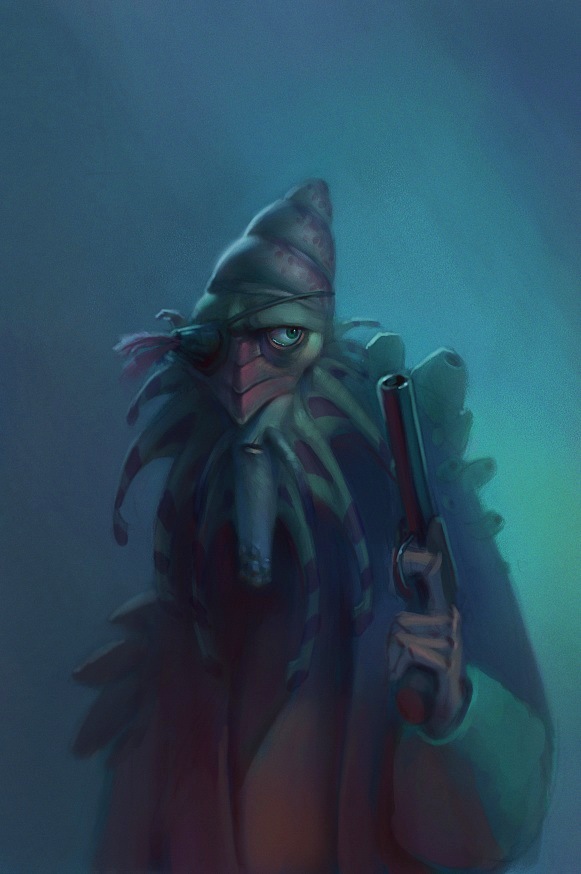
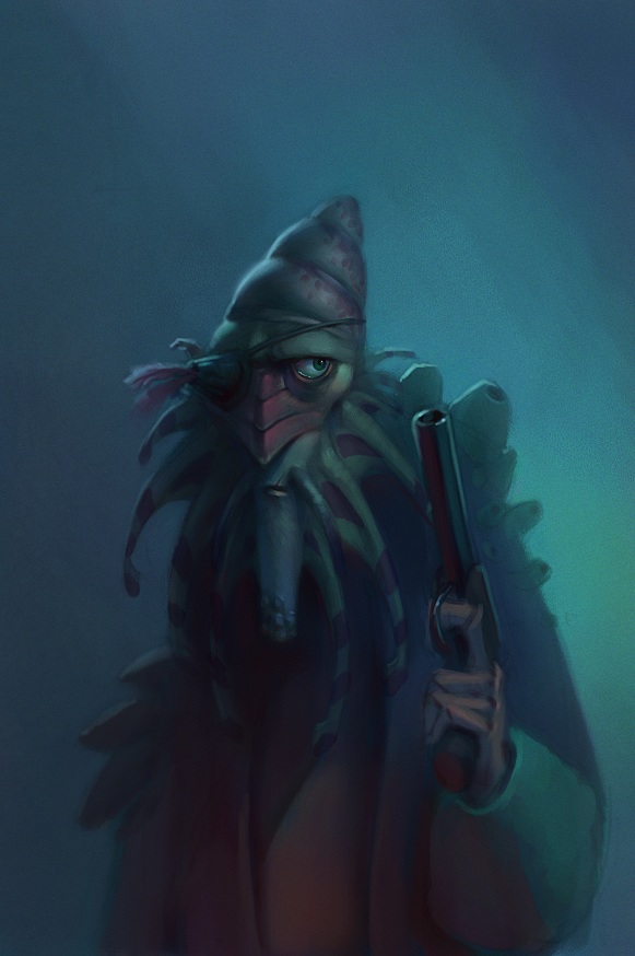
I really wasn't happy with the design of my previous pirate, so I started over. Better? Edit: We've got new monitors at work, and since they are so bright I painted this too dark. I updated with a brighter version. I'll try to avoid that in the future.
oooooo ya i agree with joe, i think it turned out a bit better, the other one seemed a little too dark, a little hard to read, but this one isperfect, the design is great and the colors help set a nice"pirate" mood(whatever that means)
Yeah, the other one is so dark because I didn't adjust the colors to compensate for our new bright flatscreen monitors at work. I hate the idea of having to do that with every painting. Oh well, at least I have more room to pile garbage on my desk.
Sweet - love the gestural feel and structure while keeping the whole thing very subtle and controlled at the same time . Really like the lighting in each of the pieces . You have a nice thing going here . Looking forward to what comes next . Nice and painterly..........
Hey Sam, Thanks for stopping by. What a great blog you have! I'm big into pirate history and this fella you did here is awesome!!!! The design, expression, story and mood is just perfect and of course the amazing coloring!
I'll definitely link you on my blog....if you don't mind that is.....aaaaawwwrrrrrghhh.


Yes, better. Though the original was great too. This guy feels more solid in his design. I like him a lot.
ReplyDeleteThis is so cool. The expression on the face is perfecto. Much improved from the last one.
ReplyDeleteI liked the last one a lot, but I agree... this one's great! There's a lot more character in him. Good stuff, Sam.
ReplyDeleteHe's dreamy!
ReplyDeleteoooooo ya i agree with joe, i think it turned out a bit better, the other one seemed a little too dark, a little hard to read, but this one isperfect, the design is great and the colors help set a nice"pirate" mood(whatever that means)
ReplyDeleteYeah, the other one is so dark because I didn't adjust the colors to compensate for our new bright flatscreen monitors at work. I hate the idea of having to do that with every painting. Oh well, at least I have more room to pile garbage on my desk.
ReplyDeleteThanks, everyone!
must be nice to be so good that you can come up with magic no matter what the monitor is set at... Yarrrrrrg! grreat post sam
ReplyDeleteAmazing work- both of these charcaters are really cool. Eye popping work across the board on your blog. Lookin' forward to seeing more!
ReplyDeleteI dig it. I think you should keep going on it. I really dig those gladiator guys that look 3D. but this is cool too.
ReplyDeleteSweet - love the gestural feel and structure while keeping the whole thing very subtle and controlled at the same time . Really like the lighting in each of the pieces . You have a nice thing going here . Looking forward to what comes next . Nice and painterly..........
ReplyDeleteWOW. Your stuff is ridiculously cool. Amazing. You are very talented...ill be back to check out more!
ReplyDeleteLove your character designs and paintings!! BEAUTIFUL!
ReplyDeleteThanks folks! I'm happy to have the feedback.
ReplyDeleteHey Sam,
ReplyDeleteThanks for stopping by. What a great blog you have! I'm big into pirate history and this fella you did here is awesome!!!! The design, expression, story and mood is just perfect and of course the amazing coloring!
I'll definitely link you on my blog....if you don't mind that is.....aaaaawwwrrrrrghhh.
Hans
His chin looks like one of those paper sno-cone cups. One that has stretched out because it's all soggy.
ReplyDeletehehehe nice work, another person who has a love for pirating and the high seas of flying ships ;)
ReplyDeletenice to meet ya!
I am really loving the rendering and colors in your stuff. The characters have a nice global illuminated feel to em. Can't wait to see more
ReplyDeleteTremendous Blogs of Fire!!! Wow you do great work! Gotta check on this site more often!
ReplyDeleteGreat stuff!
ReplyDeleteThis one is very nice -- really nice mood.
ReplyDelete