Even though I'm constantly trying to stretch myself stylistically with drawings, I hardly ever wander outside my norm when putting down color. Here's a partially-successful attempt to do something a tiny bit different.
Thanks for the kind comments. Sebastien: Used a paper texture I had at various sizes and using the square chalk. I then painted little shadows under each of the larger ones.
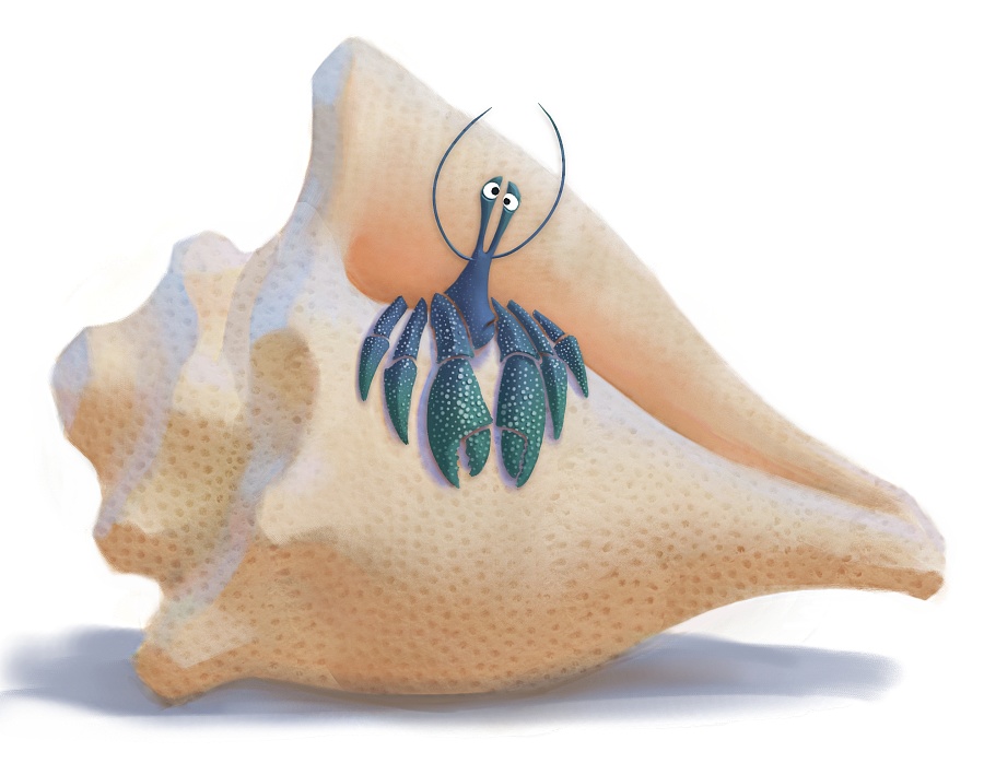


I really like the contrast of scale between the shell and the crab. The blue-green gradient is nice too.
ReplyDeleteFun. Feels like a cool relief sculpture. Or like fridge magnets.
ReplyDelete"Partially successful?" What? The only thing I don't like about it is that I can't do anything like it. You're a talented man, Sam.
ReplyDeletelike Joe's everyone loved your designs too!!!
ReplyDeletei love the large medium and small of the alligator!!!
super great stufff, time to post the next one
You have some great stuff in this blog.
ReplyDeletedef a bookmark
great work love the characters below as well! awesome blog
ReplyDeleteBeautifull Sam! Crabs are fun to draw aren't they?! :)
ReplyDeleteDid you paint the little dots on him by hand?
Thanks for the kind comments.
ReplyDeleteSebastien: Used a paper texture I had at various sizes and using the square chalk. I then painted little shadows under each of the larger ones.
Very nice and clean. The little crab design is very expressive too :)
ReplyDeleteVery funny! Design and textures are wonderful, great work :)
ReplyDeleteHey Sam!
ReplyDeleteSaw this one in class. LOVED it. How did you make it look like layers of paper?
Love this! Really has a dimensional feel to it. Those subtle texture areas, like the bumps on the crab, are pure eye candy!
ReplyDeleteI love the texture-y stuff on the shell, good stuff Sam!
ReplyDelete