Wednesday, February 28, 2007
Appeal Rant Redux
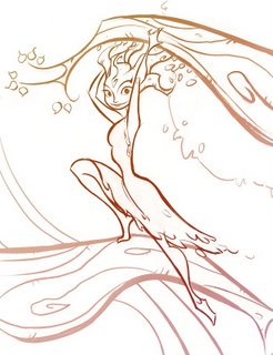
Both of these are the same assignment from the character design class : use a photo pose to create a character based on trees and plant life. I took the class twice, and this was one of the identical assignments (the first design=first time I took the class, second=second time) Which one is more appealing may be arguable to some, but in my mind the second has more appeal to it. I'll explain why below:
The first one isn't a bad drawing, or even that terrible of a design. But there are multiple reasons why it lacks the appeal that exists in the second one. First of all, I was only minimally conscious of the shapes and lines I was using---I think my major focus was on getting the linework to describe the details and form. Second, the use of space is much better in the second than the first. I think I was afraid to leave any open spaces in the character, because I was trying to describe bark and leaves and I thought I needed detail everywhere to do that.
I think I was also afraid to take some creative license with the photo reference---the proportions and pose are much more interesting in the second one. Turning the head makes a big difference since it's supposed to be a character design and not just an action drawing. That way I could put a little personality and interest into her face.
I think that being a little creative with the style helps the second one also. The first one is so straightforward and everything is presented as literally as possible. This goes into the third point I discussed earlier with appeal---I think with the second one I had a better idea of who my audience was (the teacher and students in the class) and I knew that putting a little style and flow into the lines would appeal to that group.
Looking at both of these drawings, it's clear to me now why I was so frustrated the first time I took the class. There are a lot of good things about the first design---but I think very few of those things were intentional. I can see that something was tickling at the edge of my mind. I had an inkling of what I was trying to accomplish, but I didn't have the tools yet.
Anyway, this is probably a pointless post, but hopefully it might help if there's someone in the same place I was when I was struggling through the character design class for the first time.
Wednesday, February 21, 2007
Ace in Action design diary: Foxy Loxy
Note again how the final stage of design was to "Chicken Little-ize" the design, making things more simple and streamlined, and pushing the proportions almost too far for comfort. Oh yeah, and we transferred the idea of the original Foxy's braces to become James-Bond-"Jaws" metal teeth.
Once again, the art by others on the project contributed substantially to the final look of Foxy. This was a collaborative process, which I think is what helped us reach such successful designs in the end.
Tuesday, February 13, 2007
Ace in Action Design diary: The Battle Barn
The Battle Barn was one of the hardest designs to get right. The below picture represents only a fraction of the total number of drawings and attempts we made (all of the below drawings were done by me, but lots of artists provided multiple takes that influenced the final design). In fact, I only included the drawings that acted as "steps" toward the final design---we took a lot more directions than this before settling on this design. It was really hard to design something that effectively mixed the idea of a starship with a barn, all the while giving the same flavor as the ships that the Disney artists designed for the movie.
As you can see, there were a lot of sci-fi influences pulling this thing in different directions. However, in the end (and with the help of Todd Harris) we realized that what was missing was the fun, Star-Trek-spoof feel, and that we were maybe straying too far from the "barn-iness" we needed. So I worked a bit with the proportions and the grain silo section, and viola!
(By the way, I am NOT a technically-trained industrial designer or anything, so that's why these drawings have bad form and perspective)
Here's the final concept:
Thursday, February 08, 2007
Chicken Little: Ace in Action
In the end, they liked the picture well enough to use it on the cover of the game. However, they felt the need to make a few "adjustments" first. Look here to see how they "modified" it for the final game cover. I can understand why they didn't want a pink game box for an action game, but. . .whoa. Compare it with the original:
I guess the point of this post is to clear my name, artistically speaking. The final cover is not my fault! However, the final version of the game is great, and it was a real blast to work on. I'll have more posts covering the visual development of the game later.
All images copyrights Disney 2006.