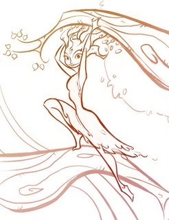
Both of these are the same assignment from the character design class : use a photo pose to create a character based on trees and plant life. I took the class twice, and this was one of the identical assignments (the first design=first time I took the class, second=second time) Which one is more appealing may be arguable to some, but in my mind the second has more appeal to it. I'll explain why below:


The first one isn't a bad drawing, or even that terrible of a design. But there are multiple reasons why it lacks the appeal that exists in the second one. First of all, I was only minimally conscious of the shapes and lines I was using---I think my major focus was on getting the linework to describe the details and form. Second, the use of space is much better in the second than the first. I think I was afraid to leave any open spaces in the character, because I was trying to describe bark and leaves and I thought I needed detail everywhere to do that.
I think I was also afraid to take some creative license with the photo reference---the proportions and pose are much more interesting in the second one. Turning the head makes a big difference since it's supposed to be a character design and not just an action drawing. That way I could put a little personality and interest into her face.
I think that being a little creative with the style helps the second one also. The first one is so straightforward and everything is presented as literally as possible. This goes into the third point I discussed earlier with appeal---I think with the second one I had a better idea of who my audience was (the teacher and students in the class) and I knew that putting a little style and flow into the lines would appeal to that group.
Looking at both of these drawings, it's clear to me now why I was so frustrated the first time I took the class. There are a lot of good things about the first design---but I think very few of those things were intentional. I can see that something was tickling at the edge of my mind. I had an inkling of what I was trying to accomplish, but I didn't have the tools yet.
Anyway, this is probably a pointless post, but hopefully it might help if there's someone in the same place I was when I was struggling through the character design class for the first time.


I love the lines in the second one. They are so flowing and expressive. The color is good too, the subtle color change was a nice touch.
ReplyDeleteBoth appealing in their own way, but I agree... the second one is loaded with appeal. Not a pointless post at all.
ReplyDeletei like your paintings so muchªªªªªªªª
ReplyDeletewhat brusher do you use to paint with corel painter?????
benja
Yep both are great! The line work and space in the 2nd image has a real elegance - and that for me makes it best! You'd make a great teacher Sam
ReplyDeleteI love the flow in the second image. I really like the shape of her legs, too.
ReplyDeleteVery very cool. I love the flow, composition and shapes on the bottom peice. Very appealing. And I love the feel of the top peice. Awsome stuff man.
ReplyDeleteThese drawings are great. I haven't made stuff up like this and I can tell you have a lot of knowledge that I can gain.
ReplyDeleteDo you ever work in oil paint? It would be cool to catch up and paint sometime