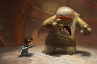
Nicktoons Network has Pajama Gladiator posted up for a day so people can vote on it. Hurry and watch it before they take it down.
Things I did on the short:
- pitched the original story---a bit different from how it turned out, but I still feel happy that it was the project people picked
- worked with Joe Olson to do the majority of the character and environment pre-production art
- modeled the horned guy (didn't do the acid-purple surfaces)
- did surfaces for the "Cyclops" character in Renderman
- animated a couple scenes, including the "Cyclops freaks out scene" at the end of the battle
Things I learned from doing the short:
- No matter how much you contribute during pre-production or production, the folks that really matter are the post-production guys. This short never would have been done without those guys and they deserve all the credit in the world.
- The timing you get in the story boards/animatic is probably not tight enough for the final renders and animation. This thing felt really good at first, but now all I notice are the awkward gaps in the timing.
-Don't suggest a freeze-frame action montage unless you're willing to back it up with an example of how it should look. This is the most awkward part of the short, by far.
- Don't complain about the rigs on a student project, no matter how bad they are. Either help design them so they get them right, or shut up so you don't get the all-powerful rigging guy mad at you.
- It's hard to get people to see eye-to-eye on a group student project. Period.
In spite of all these problems, I think it turned out pretty good for a student short and I'm proud of it.


Asolutely AMAZING stuff! Really wonderful! I love the style of the end credits too - very nice! What's the music? Sounds kinda like "the Rock"!
ReplyDeleteGreat stuff, Sam. I loved this short. Well done, and congrats on the awards!
ReplyDeleteWow, incredible work Sam!
ReplyDeleteYour work is great! Really funny.
ReplyDeleteGreetings from Spain.
Great fun, Sam. Maggie, Dan, and I watched it 3 times this morning and loved it.
ReplyDeleteYour paintings are so amazing... there's such a cool luminous quality and the colors are lovely!
ReplyDeleteamazing particular colors
ReplyDeleteCongradulations on a job well done, it was a great short. I really liked the one eyed monster, great animation. Your illustrations are really great too, I love how you light the characters, nice rendering. Looking forward to seeing more.
ReplyDeleteIt's kinda funny, but I watched it before reading your post and the critiques you mention are the same thoughts I had.
ReplyDeleteI thought the freeze-frame parts needed the standard Batman >KAPLOOIE< or >POW< added to them and then they would have worked. Ha ha. j/k.
Anyhow, critiques aside, beautiful art and lighting.
I'm very impressed! We got a link a week ago and thought it was such a cute cartoon--now I feel famous knowing someone who had a hand in it!
ReplyDeleteThis looks awesome!!!!!
ReplyDeleteThis is just awesome.
ReplyDelete"All powerful rigging guy" That's too true. If you can still talk to the other people who worked on the project than it's a success. It's an impressive achievement, congrats on getting it into Nick's competition.
ReplyDeleteyour painting is really incredible, this is amazing stuff.
ReplyDeleteWeb Designer | Web Hosting
I know I'm late, but I just checked that out and it was gorgeous work!
ReplyDelete