Since James Gurney has already covered this subject in great detail, rather than cover the basics again, I'll just add a few thoughts to the discussion.

The advantage to a traditional triadic color scheme is that its even nature comes across in images using it. It's not an exciting color combination, but the even and predictable nature of it makes it comfortable, almost friendly.

This may not be a surprising discovery to some, but I've noticed that the farther you push a color scheme away from peak saturation and value, the more you lose the strengths of that color scheme. However, the colors still retain a shadow of what they used to be, so even at its extremes a color scheme has a hint of the message that goes along with it.

While a triadic color scheme can feel balanced, safe, and even child-like, which triad you pick for your subject matter can still strongly affect the mood of your image. Look at the difference that happens by shifting just a little in one direction:


Don't expect too much from a color scheme, though, because the color scheme is often one of the weakest factors in communicating the emotional tone of an image. If I were to assign a priority to the effectiveness of a design element in establishing the theme, emotion, or message of an image, I'd place the priorities something like this:
(Most effective)
1. Style
2. Subject matter/content (I would include shape language here)
3. Lighting scheme
4. Value/color composition
5. Surfaces/Textures
6. Color scheme
(Least effective)
These all might switch places depending on the image, but the point is, don't count on a color scheme to solve your problems if your drawing, lighting, etc. aren't saying what they're supposed to.

 |
| If anything, the primary colors make him seem even more freaky |


good shtuff, sam! weird question, but:
ReplyDeleteI'm surprised how good your chameleon looks even after shifting the hue of the entire piece.... usually if i try that with a painting (or a texture), it completely falls apart. If I plan on making color variations of a texture after i'm finished, is it best to start with a triadic scheme?
hope that makes sense...
Tyson: It's not just a color shift, I had to do a bit of coloration by hand to get it right. What makes things fall apart when you do a color shift is when there are variations in hue and saturation as the light wraps around the form (as there should be). Getting those parts to look right after the shift can be very hard. I don't imagine it would matter whether you used a triadic scheme or not.
ReplyDeleteHis works are fantastic Sam.
ReplyDeleteHis tutorials are helping me a lot. You are an inspiration to us all.
Thanks man!
Oh. This may explain why I get so messed up sometimes trying to color correct all these family photos I'm archiving. I'm working in RGB with a mind that's spent sixty years in a traditional colorwheel. I'm blinking a little bit here. Trying to wrap my head around this. My monitor is RGB; I use levels to do the work - but what I see and the way it interfaces with what I remember from the real world - adding, mitigating, changing levels sometimes just doesn't have the effect that I thought it would, and I tend to forget about the CM elements at all, not working with them much. My instincts are almost counter-useful.
ReplyDeleteTiny vacations in learning here - a little mind stretching for old dogs.
That scale of importance is really helpful.
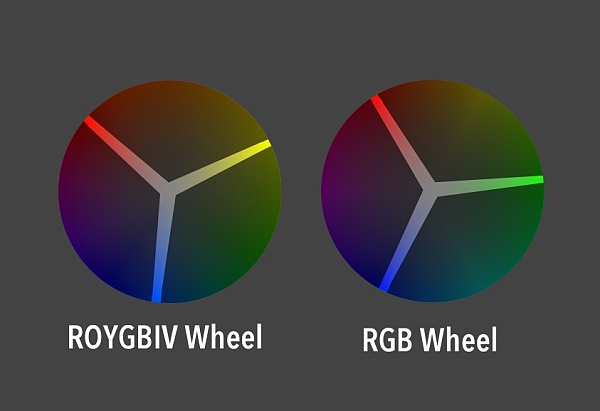
ReplyDeleteI was wondering about the Ives color wheel? How do you feel it compares to the ROYGBIV one? Or any other thoughts you might have on it.
ReplyDeleteMatthew: The Ives color wheel is, in this context, identical to the RGB wheel. The arrangement of complements and triads is very similar. The Ives color wheel is basically the CMYK palette for traditional paint, so all the limitations you run into with print will also apply here (but it is much easier to mix many colors from it than using traditional primaries).
ReplyDeleteBut digitally, it's the same as RGB.
Cool, thanks for that info!
ReplyDeleteyes ! That scale of importance is really helpful indeed !!! I think it deserves a whole other big post even !
ReplyDeleteit helping to good work. thanks...
ReplyDeleteawesome!
ReplyDeleteThis is a great post once again. For those working digital I recommend the colorscheme designer : http://colorschemedesigner.com/ which is a free online tool, but it helps to understand what one can do with this mighty tool.
ReplyDeleteOther than that I totally agree and think color is often overated. I try to explain it rather simple when working and explaining images to students; I put levels first, than shape and then detail, it is easy to remember if you just use the initials: lsd :)
Je suis heureux de chercher votre stratégie distingué de développement de la publier.
ReplyDeleteFarbkorrekturmasken
This comment has been removed by the author.
ReplyDeleteNice sharing for this info. Thanks...
ReplyDelete