Thursday, August 23, 2007

More bus drawings

One of these times I'm going to draw more than the head and shoulders, you just wait and see.

Wednesday, August 22, 2007

Wanted in the Wild West

A couple quick pictures I did for the latest Avalanche blog topic. I realize now that it should be Lucky Lucy. Duh.


Monday, August 13, 2007

Doctor Von Auch

I made this for a presentation I did on character design. The presentation was about an appoach to character design I've been developing for a while now, with the help of others at Avalanche like Todd Harris. For the presentation, I took people through the steps of making a character appealing for a specific audience and purpose.

I decided to take an old drawing of a torture specialist and try to make him appealing to a 7 to 9-year-old audience (fun!). I picked this drawing because it's not necessarily a bad drawing, and he might even be appealing to an older audience---but the point of my presentation was to emphasize that design is different than drawing and that appeal is subjective depending on the audience.

So in order to make this guy more appealing to a mixed 7-9-yr-old audience, I made up a backstory that he used to have a medical practice, but he went out of business because his patients were creeped out due to his hairless condition. He picked up the torture gig on the side just to make money, but unfortunately discovered his latent fear of needles and a tendency to faint at the sight of blood. Then with the audience and this personality in mind, I essentially applied various design principles to him and he sort of evolved naturally.

This is the beginning character (left) and the end result (right). Ask your 7-year-old daughter or nephew which one she or he likes better so I can find out if I was successful.

Tuesday, July 31, 2007

Level 25 Construction Worker

After seeing Adam Ford's, Ryan Wood's, and Dave Malan's version of this guy, I got to thinking how many different ways you could color the same picture, and I couldn't rest until I did one that felt different. I think maybe it turned out too different, this time around.


Thanks to Joe Olson for the awesome line art.

Thursday, July 26, 2007

Sorry, but yet another caricature

I did this for the Avalanche topic as well as for a workshop series by Dave McClellan. This one combined value with saturation, so we could work with the effects of warm/cool relationships.

Monday, July 23, 2007

Lazy caricature

This girl was funny, always stretching her lips out and adjusting her face, like she was afraid still that her mouth would get stuck in one expression if she held it long enough. Or maybe it's that super-self-conscious model mindset. Either way, it was hard to do her face.


I generally hate the big-head-small-body type of caricature, and that's how this one ended up looking, so boo to me. I fuzzed out the terrible body I did though, so at least you don't have to deal with that part.

Monday, July 16, 2007

Friday drawing session

Avalanche has a figure drawing session every Friday, but I'm not an accomplished figure drawer, so I don't often spend much time in there. I guess I'm uncomfortable drawing around all the people here who can whip out amazing figure drawing after amazing figure drawing. I'm lucky when I don't end up with some type of disproportional disaster. Still, it's good to exercise my drawing and design muscles. Sometimes I'll use the session to do a caricature or cartoon version of the model, which I think is useful in a different way. I was only in there for a few minutes this last Friday, so I focused on the head of this guy. It's hard to caricature someone who has the "model look," because their faces are so darn normal.

Thursday, July 12, 2007

Robohobo

I did this simultaneously for the Avalanche Blog topic and a workshop on value by Dave McClellan. I like killing two birds with one stone. Or at least maiming one while inflicting mild abrasions on the other.

Thursday, June 28, 2007

Fat fish

I realized I hadn't posted in a little while, so here's a quick fish to provide the illusion of productivity:

Friday, June 08, 2007

Hitmen

For the Avalanche blog, but I'm posting here also so it looks like I'm keeping this blog up to date.

Wednesday, May 30, 2007

Sorry for the wait

I've been out of town. Here's an Avalanche blog post. I think I keep painting things too dark though, because they always look wrong on my cruddy old monitor at home. Or maybe that's just because it's a cruddy old monitor.

Wednesday, May 09, 2007

Happy Demon

I wanted to spend a lot more time on this, but it's been a while since I posted last, so I got impatient.


Nothing is more evil than a magenta demon.


Wednesday, April 18, 2007

Meet the Robinsons game

I did some very early concept art for the game, none of which was used. It was fun to kick out some wild ideas of how things should be, though. Lots of this stuff was really quick because I knew it was very likely to be rejected. I'll make a couple more posts with it art for the game in days to come.


All images copyright Disney 2007.

Thursday, April 05, 2007

Thursday, March 29, 2007

More funny faces

Been busy this week, so sorry for the lame post. The first one is, in fact, a lady. She's the bus driver in the morning. I don't feel bad making fun of her, because she is the devil.

Friday, March 16, 2007

Funny faces

I want to start drawing from life more. It's fun, and feeds my brain with new ideas.


Here's a couple doodles of people from the bus, and a drawing of the model from my work's "drawing session" this morning. She had this funny grimace-smile that I wanted to capture.
The colors on the first one turned out awful because I started out trying to paint him in bluish light, but that failed so I changed it. I need to experiment with other types of lighting, though.


Wednesday, February 28, 2007

Appeal Rant Redux

Here's an example from my earlier post on Appeal. I talked about three things that influence the appeal of a design: Effective use of design principles, creativity, and attention to audience and purpose. Maybe not all three apply here, but it's still an okay example.
Both of these are the same assignment from the character design class : use a photo pose to create a character based on trees and plant life. I took the class twice, and this was one of the identical assignments (the first design=first time I took the class, second=second time) Which one is more appealing may be arguable to some, but in my mind the second has more appeal to it. I'll explain why below:

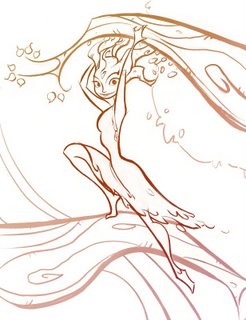


The first one isn't a bad drawing, or even that terrible of a design. But there are multiple reasons why it lacks the appeal that exists in the second one. First of all, I was only minimally conscious of the shapes and lines I was using---I think my major focus was on getting the linework to describe the details and form. Second, the use of space is much better in the second than the first. I think I was afraid to leave any open spaces in the character, because I was trying to describe bark and leaves and I thought I needed detail everywhere to do that.
I think I was also afraid to take some creative license with the photo reference---the proportions and pose are much more interesting in the second one. Turning the head makes a big difference since it's supposed to be a character design and not just an action drawing. That way I could put a little personality and interest into her face.
I think that being a little creative with the style helps the second one also. The first one is so straightforward and everything is presented as literally as possible. This goes into the third point I discussed earlier with appeal---I think with the second one I had a better idea of who my audience was (the teacher and students in the class) and I knew that putting a little style and flow into the lines would appeal to that group.
Looking at both of these drawings, it's clear to me now why I was so frustrated the first time I took the class. There are a lot of good things about the first design---but I think very few of those things were intentional. I can see that something was tickling at the edge of my mind. I had an inkling of what I was trying to accomplish, but I didn't have the tools yet.
Anyway, this is probably a pointless post, but hopefully it might help if there's someone in the same place I was when I was struggling through the character design class for the first time.

Wednesday, February 21, 2007

Ace in Action design diary: Foxy Loxy

Developing the look for Foxy as the main villain was fun. At first we were exploring all sorts of ideas---Foxy as a dark-helmeted evil warrior, or as a fat Jabba-style criminal, and we even played with various alien versions of her. We just wanted to create a great archetypal villain that was the perfect cheesy-sci-fi counterpart of Ace. Along these lines, the story team started pushing this idea of a beautiful-but-dangerous villain with an eyepatch and who had some kind of vague love-interest history with Ace. I thought this idea was perfect, and her design almost flowed automatically from that point onward.


Note again how the final stage of design was to "Chicken Little-ize" the design, making things more simple and streamlined, and pushing the proportions almost too far for comfort. Oh yeah, and we transferred the idea of the original Foxy's braces to become James-Bond-"Jaws" metal teeth.


Once again, the art by others on the project contributed substantially to the final look of Foxy. This was a collaborative process, which I think is what helped us reach such successful designs in the end.

Tuesday, February 13, 2007

Ace in Action Design diary: The Battle Barn

I had fun with this project and I'd like to share a little bit of the process that went into the visual development of it. I won't do this with all of the concept art we did for the project, but maybe for a couple of my favorite designs.
The Battle Barn was one of the hardest designs to get right. The below picture represents only a fraction of the total number of drawings and attempts we made (all of the below drawings were done by me, but lots of artists provided multiple takes that influenced the final design). In fact, I only included the drawings that acted as "steps" toward the final design---we took a lot more directions than this before settling on this design. It was really hard to design something that effectively mixed the idea of a starship with a barn, all the while giving the same flavor as the ships that the Disney artists designed for the movie.
As you can see, there were a lot of sci-fi influences pulling this thing in different directions. However, in the end (and with the help of Todd Harris) we realized that what was missing was the fun, Star-Trek-spoof feel, and that we were maybe straying too far from the "barn-iness" we needed. So I worked a bit with the proportions and the grain silo section, and viola!


(By the way, I am NOT a technically-trained industrial designer or anything, so that's why these drawings have bad form and perspective)
Here's the final concept:

Thursday, February 08, 2007

Chicken Little: Ace in Action

One of the games I did concept art for recently came out---a "sequel" of sorts to the Chicken Little movie, based on the buffed-out movie-within-a-movie version of Chicken Little and his buddies. Originally Buena Vista Games wanted us to do a straight up Chicken Little 2 sequel, but we liked the creative freedom and game play possibilities presented by CL's alter-ego. This image was an attempt to "sell" the idea to BVG and the marketing guys.

In the end, they liked the picture well enough to use it on the cover of the game. However, they felt the need to make a few "adjustments" first. Look here to see how they "modified" it for the final game cover. I can understand why they didn't want a pink game box for an action game, but. . .whoa. Compare it with the original:


I guess the point of this post is to clear my name, artistically speaking. The final cover is not my fault! However, the final version of the game is great, and it was a real blast to work on. I'll have more posts covering the visual development of the game later.

All images copyrights Disney 2006.

Thursday, February 01, 2007

Eagerly Awaiting His Shadow

Another one for the Avalanche Blog Villain topic.

These villains are a lot of fun. I think I might do yet another one.