Thursday, February 08, 2007

Chicken Little: Ace in Action

One of the games I did concept art for recently came out---a "sequel" of sorts to the Chicken Little movie, based on the buffed-out movie-within-a-movie version of Chicken Little and his buddies. Originally Buena Vista Games wanted us to do a straight up Chicken Little 2 sequel, but we liked the creative freedom and game play possibilities presented by CL's alter-ego. This image was an attempt to "sell" the idea to BVG and the marketing guys.

In the end, they liked the picture well enough to use it on the cover of the game. However, they felt the need to make a few "adjustments" first. Look here to see how they "modified" it for the final game cover. I can understand why they didn't want a pink game box for an action game, but. . .whoa. Compare it with the original:


I guess the point of this post is to clear my name, artistically speaking. The final cover is not my fault! However, the final version of the game is great, and it was a real blast to work on. I'll have more posts covering the visual development of the game later.

All images copyrights Disney 2006.

Thursday, February 01, 2007

Eagerly Awaiting His Shadow

Another one for the Avalanche Blog Villain topic.

These villains are a lot of fun. I think I might do yet another one.

Friday, January 26, 2007

Villain for Avalanche Blog

This was fun and quick. I think I'm going to do another villain soon. Or maybe more.


Thursday, January 18, 2007

Curse of Zumtar entry

I posted this up on the Avalanche blog a couple of days ago but forgot to put it here. I realized after I posted it that it might be better if there were feathers falling around him, but then I decided it wasn't worth the extra work.

Sunday, January 14, 2007

RANT of the Week: APPEAL

Now that I've finished the character design class for the second time, I have a few thoughts I'd like to vent.
The first time I took the class a couple of years ago was the first time I'd ever heard about the concept of "appeal" in character design. I knew that some drawings were appealing to me, and that others were not, but I was sort of surprised when a drawing that I liked a lot was heavily criticized for lack of "appeal." But I think as the semester wore on, I started to see beyond the quality of the drawing itself, and in time I started to be able to perceive when a character had something special that made the design itself appealing. The way Ryan Woodward explained it left me with the impression that appeal is an almost magical quality designers strive for and almost have to just "feel out" in a design. I was frustrated because I didn't have a clue how to infuse my designs with this appeal, even though I recognized that they were lacking in it.

Since then I've done a lot of concept art at work, and I've studied a ton about what other designers are doing and why. I've especially learned a lot from the artists at Disney as we've tried to duplicate the styles they've developed for the movies. The head concept guy here at work has been helpful as well. And finally after taking the class a second time I think I'm starting to get a handle on this "magical" quality called appeal. So here's my three basic conclusions about appeal. Feel free to argue in the comments if you have a disagreement or correction for my theory:

Let me suggest first of all that appeal isn't magical or mystical. It's pretty straightforward, actually. The three ideas that influence appeal are: Effective use of design principles, creativity, and attention to audience and purpose.

Using design principles to increase the appeal in your design is one of the most surefire ways to add appeal. Honestly, I've seen artists take the most generic character idea and turn it into something appealing by playing with the shapes, the proportions, the colors, the lines, the textures, etc. I can post an example of this later. It's a simple solution, but sometimes the most effective one. I'll add one thing to this list that isn't really a design principle but I think it fits under this same idea: personality. It's another one of those easy fixes for adding appeal to a character design---often just giving a character a facial expression or a pose that gives them life or some kind of attitude will do a lot.

Creativity is another thing to add appeal, although this is the tough one that's maybe a little more like magic. But it's helpful if you can make your character different than other characters that people have seen. Some people go way overboard with this---making their character TOO different---and I think it's important to keep designs at least somewhat in the realm of familiarity. But unless you're specifically trying to duplicate something that has been done before (like for the sake of parody), try to be creative and your character will be more appealing.

Finally, I think understanding your audience and purpose is the number one struggle in making your character appealing. Ryan was always critiquing based on whether our designs appealed to him, which is fine, but he never said anything about other audiences and I think a professional character designer needs to think about that. What's the demographic of the intended audience? What kinds of design attributes appeal to an 11-year-old girl? When you start to think about these things, suddenly it gives a context for the principles you need to focus on when designing.
For example, teenage and young adult males tend to find detail/texture and a sort of heightened realism appealing. That's the only reason why Rob Liefeld was ever able to sell comics. On the other hand, very young children are attracted to simple shapes and bold colors---hence the development of the "Cartoon Network" style of art. I don't think there's a simple set of rules and associations we could list out for which groups of people like what, and I wouldn't be surprised if a lot of those factors are socially or environmentally influenced and change with time. In fact, I think we've seen examples of new art styles that take hold of a segment of the populous for a short period of time, but then fade away. So there's no reason why you have to draw everything like Cartoon Network to appeal to kids. But if you want to make something that kids will like, it will help to pay attention to the design ideas that make what kids like so appealing to them.
I think the other thing that ties into audience is purpose. Why are you designing the character? What role are they supposed to play and how should they play to audiences? How will the art style affect the apparent purpose of the characters or the project? Basically, ask yourself which design principles you will focus on in order to reach that audience and fulfill the purpose that the designs are meant to fill. And I strongly suspect that any design that is creative, fulfills its purpose, and uses all the design principles appropriately, will be appealing to its intended audience. And who knows, maybe if you've got that extra touch of magic, you can do just the right things to make that design appealing to everybody else as well.

Well, I'm glad to have gotten that off my chest. I'm sure there's more to it that I've missed though, so I'm open to any other ideas on the subject. Thanks for listening.

Tuesday, January 09, 2007

The rest of the final project: Environment 2 and Villain

I think I've been dragging this out long enough and need to move on and start something new, so here's the last pieces. I don't have anything else to say about them, so here they are.


Thursday, January 04, 2007

Character design final project: Love interest

Since I missed an entire week last week, here's the second one in two days.
This is the love interest for the hero (the boy posted below). She's supposed to be a couple years older than the boy, and I think he's a tiny bit young for there to be a meaningful love interest going on, but she fills the role for the sake of the assignment. I think this is my second favorite character out of the bunch, right next to the elephant.

Wednesday, January 03, 2007

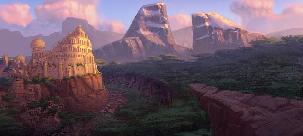
Character design final project: Environment

Don't ask me why we're doing an environment in a character design class. I guess the class IS called Character Design and Visual Development, but it is strange to have an environment suddenly lumped in there at the end of the semester.
I realize that there are a few design problems with this one (the repetitive shape size being one), but I was rushed to finish these and didn't catch the problems until it was too late to be worth the effort to fix.

Thursday, December 21, 2006

Character design final project

It's a relief to be done with everything for the semester! I'm probably going to be taking a break for a little while, so until then I'll trickle a new image from my final project every couple of days.
The assignment was to take one of our characters from earlier in the semester and design three other characters to go with it---so that in the end we would have a hero, a love interest, a comic sidekick, and a villain---all done in the same style. Then we had to do two environments from their world.

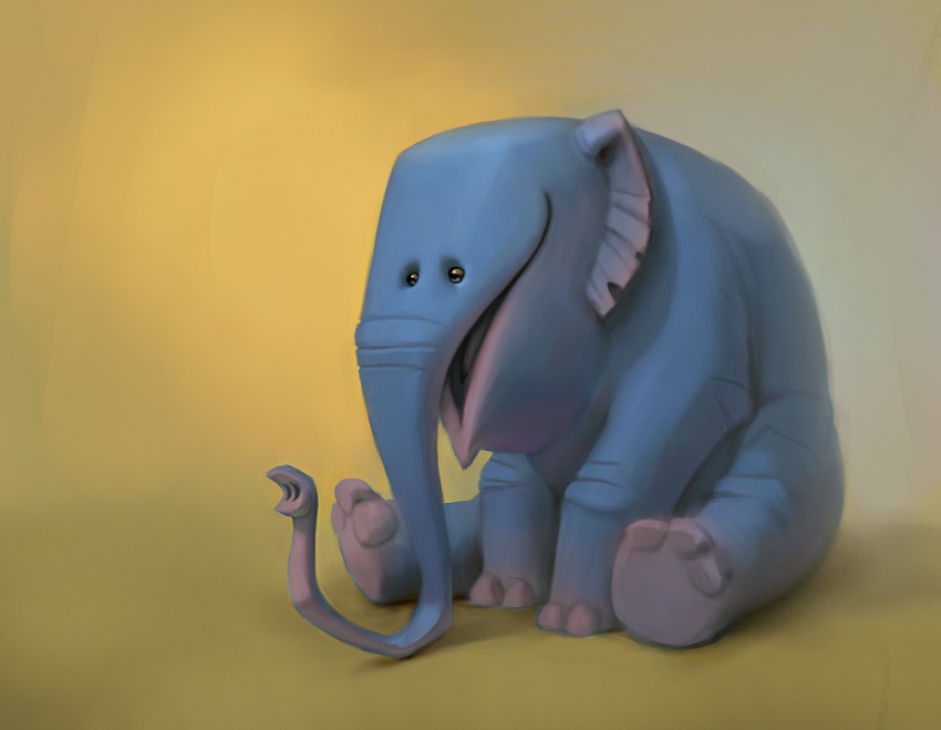
So here's the character I picked to design around, fitting him into the role of comic sidekick:


And here's his buddy, the hero. I'll post the others later, so check back soon!

Monday, December 18, 2006

Random head

Some old scraps to keep visitors from getting too bored while I finish my final project for the character design class. This was loosely based on an earlier design I posted.

Friday, December 01, 2006

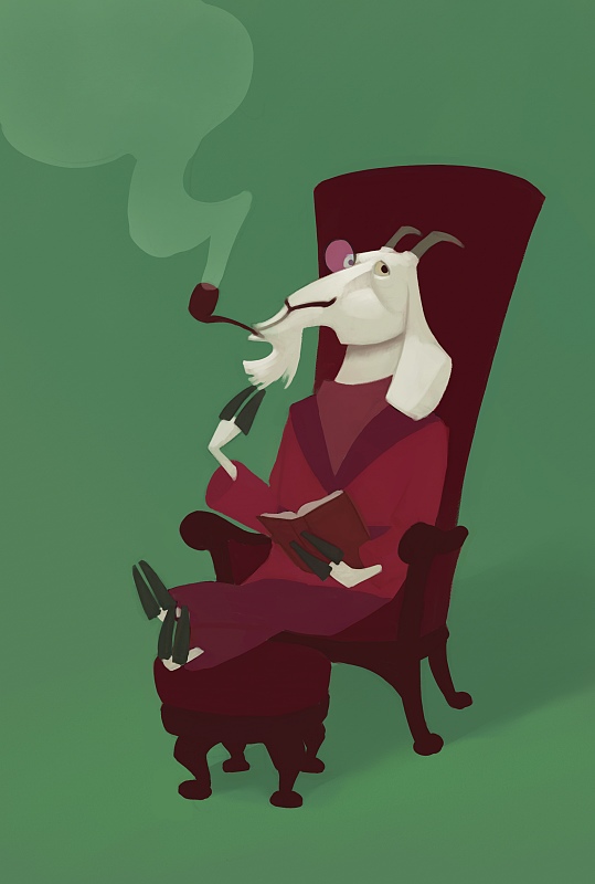
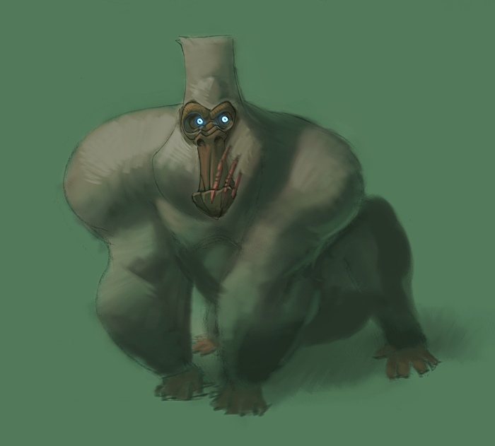
Goat + Gorilla

The other parts of the 2nd animal assignment. I was going to spend a bit more time on these before posting them, but I suddenly got very busy and I doubt that I'll get back to them anytime soon. So here goes anyway:


Monday, November 27, 2006

Animal assignment part 2

I'll post up the other ones this week as I put the finishing touches on them.

Friday, November 17, 2006

Chatty Macaw

I like to think about what this Macaw is blabbering about to that poor dragonfly. I can't say how many conversations like this I've sat through. . .

Thursday, November 16, 2006

More animal assignment

Even though I'm constantly trying to stretch myself stylistically with drawings, I hardly ever wander outside my norm when putting down color. Here's a partially-successful attempt to do something a tiny bit different.

Tuesday, November 14, 2006

Animal assignment

Ryan Wood gave the suggestion to spread the posts for these assignments out over the week, so I'm going to try it. This assignment was to design a reptile, flying animal, and oceanic creature (there were more categories, but those were the ones I picked). This is my reptile, and the one I'm happiest with. I think I may make a few adjustments to the others before posting them. Any feedback would be appreciated, since I'm not able to attend the critique session for the class.

Tuesday, November 07, 2006

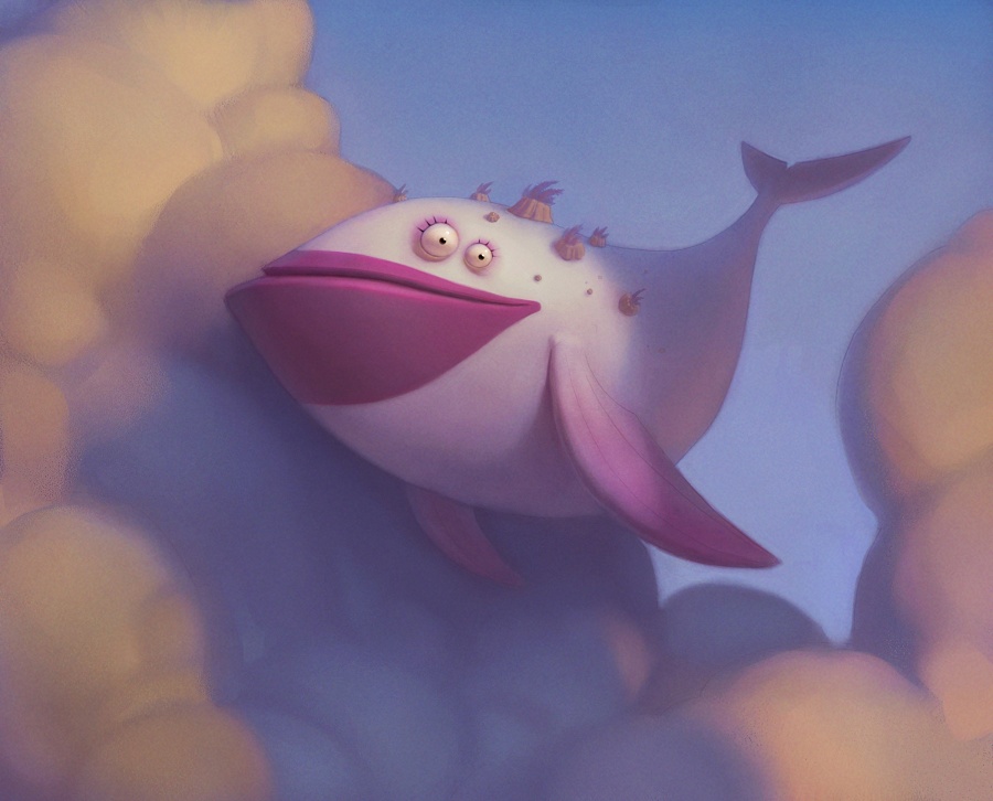
Fish in the sky

These are for a short that is the brainchild of Joe Olson and myself. Joe did the character designs, I did the colors. I don't want to say anything more about it so I don't ruin the story.

Tuesday, October 31, 2006

Heroes and Villains part 2

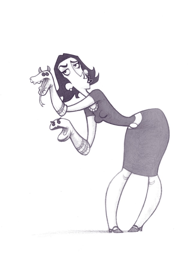
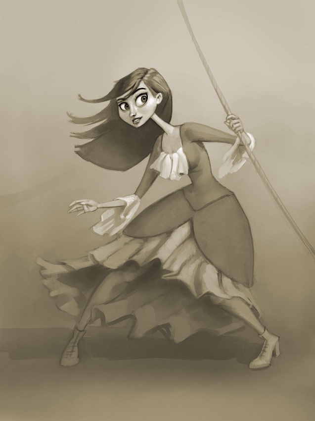
The other two images from the assignment. I'm much happier with these two than I was with the first characters. First lady is an "unlikely villain" and the second is a female hero that is supposed to have what Ryan Woodward calls "sex appeal." Personally, I don't like the term because it encourages students to focus on the wrong aspects of what makes a female character attractive. I just like to say that she's pretty.

EDIT: Just to clarify, I'm not saying that Ryan is encouraging the wrong approach to making tasteful female character designs---I'm saying I don't like the term "sex appeal" because taken by itself, could give the wrong impression. Hope I didn't give anyone the wrong impression with that---if so, I'm sorry.


Any critiques are welcome!

Monday, October 30, 2006

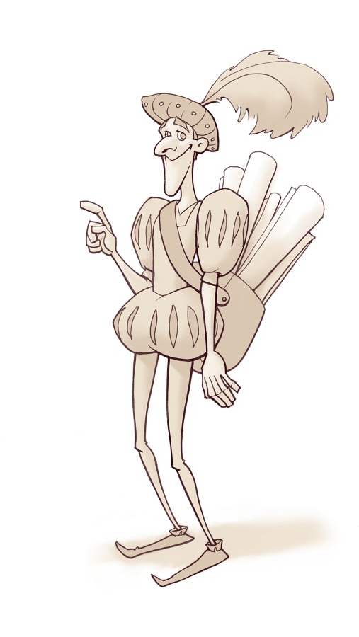
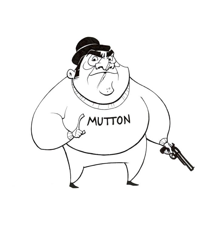
Heroes and Villains

Another character design assignment on heroes and villains. I've got two more on the way that I'll post tomorrow.

This first fellow was for the "unlikely hero" part of the assignment, and who would make a more unlikely hero than a cartographer? I was probably thinking about Wally from the Monkey Island series.


A stereotypical villain. And yes, this was a half-hearted effort at imitating Joe Olson's style.

Friday, October 20, 2006

Lady Ghoulsmire

Another one for the Avalanche blog.
Don't you hate it when you know something is wrong with an image, but just can't quite figure out what you're screwing up? I don't know, maybe it's that old middle-of-the-month artist slump.


Here's a close-up, in case anyone's interested.

Wednesday, October 18, 2006

RANT of the week: Caricature

Okay, I've got to get something out of my system. Throughout my classes today, I noticed many other people working on this caricature assignment. Some of them were either taking the assignment lightly or complaining about its relevance to character design. I'm not a great caricature artist, but I believe strongly in its value to character designers. So this post is for all those in my class who don't believe caricature is important:

In my opinion, caricature is the ultimate design exercise. Think about how these elements are used by the very best caricature artists:
Line.
Shape.
Proportion.
Form.
Texture.

That list sounds familiar, hopefully! Caricature isn't just about distortion, recognition, and good rendering.
Good caricature is really about finding just the right design element(s) that simultaneously give a character both recognition and appeal. This same principle applies to object and environment design. Usually in entertainment, audiences have only a split second to register what they are seeing, so recognition is essential. But recognition isn't enough by itself, since audiences lose interest quickly if what they see isn't appealing.
Sebastian Kruger isn't a great caricature artist just because he renders details so well. I think his caricatures would be just as effective even without his insane painting ability, because he efficiently uses basic design elements (such as shape and line) so that they simultaneously bring recognition and appeal to his characters.

For examples of how the principles of caricature result in good character design, look at the work of Stephen Silver, David Colman, Shane Prigmore. I could provide a much longer list, but I think I've gone on for long enough now.


EDIT- A couple more thoughts I had this morning:
The very best live-action film designs also use a type of low-level caricature in their costume designs and makeup to make them easily readable and more appealing. The Pirates of the Caribbean movies are a good example of this.
There are a lot of bad caricatures out there---I'm sure you see them all the time. These caricatures are usually recognizable, and the people who draw them can feel proud for getting that part right. However, a drawing a million such caricatures won't make those people into good character designers because they aren't using the principles of design correctly, and their focus is usually only on recognition and not appeal. What I'm trying to get at is if caricature is exercise for designers, then the principles of design are the weights. If you're serious about design, you can't treat caricature just as a way to get cheap laughs.

Caricature assignment

This week's assignment was to do caricatures. Since this is the second time I've taken the character design class, the teacher let me choose my own subjects.
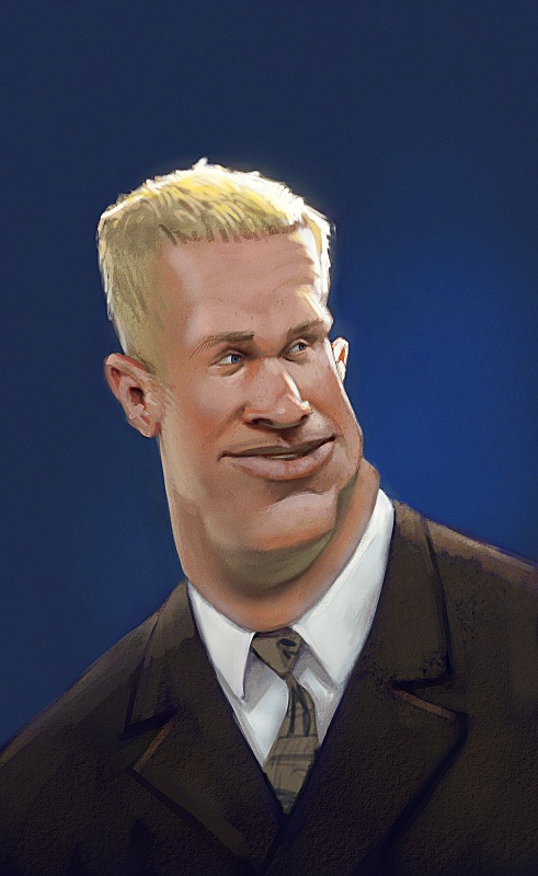
I'm a big fan of BYU football, and so I thought it would be fun to try the head coach, Bronco Mendenhall. Unfortunately, there's not a ton of photo reference available of him on the web, so I'm not sure how close I came to his likeness.


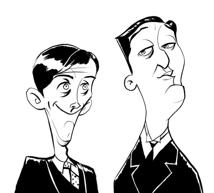
I also like the BBC series "Jeeves and Wooster" with Stephen Fry and Hugh Laurie. I don't think my likeness of Bertie Wooster is all that great, but I'm pretty happy with Jeeves. Also, I think I'm in love with Painter's "Dry Ink" brush.


I'm also working on Miranda Otto (I also like the Lord of the Rings movies), but I'm probably not going to finish her until just before the assignment is due.

Thursday, October 05, 2006

Arena Lighting and Surfaces

Well, I finally finished it. Like the kitchen, I feel like there's lots of things I could fix if I spent another 20 hours on it, but I feel like it's just not worth the effort. Hopefully it gets the necessary information across anyway.

Tuesday, October 03, 2006

Tuesday, September 19, 2006

Char. Design assignment: Shape Drawings & Nature

The first part of the assignment was to draw loose shapes and then make them into character designs. It's definitely a fun creative exercise, but I think the most useful part of it is how it forces you to play with proportions. Since the dimensions are already set out for you, the challenge becomes to determine how to arrange things within that shape to make your character the most appealing. I can't say that I was entirely successful in picking the best proportions for these guys, but it was a lot of fun anyway.


I forgot to scan in the original shapes, so I included quick trace to show what I started with.


The other part of the assignment was to (after doing some drawing from nature) do some character designs incorporating elements from rocks, trees, and clouds. We had two photos we were supposed to base the character designs off of, which I didn't scan in. I didn't really use anything from them anyway, other than a loose gesture of the pose. Edit: Here's one of the pictures, anyway. No matter how hard I try, I can't get the rock guy to upload. Maybe later, then.

Friday, September 01, 2006

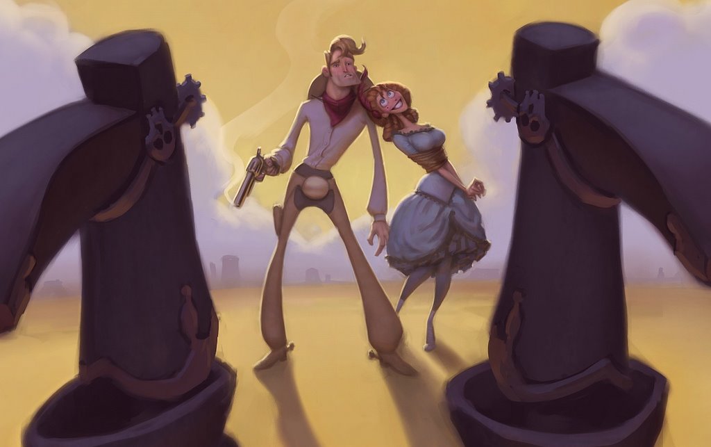
Spaghetti Western Entry

Haven't had time to do a tip-of the week yet. This is the most I can muster for now: Rim-lighting makes things more fun!
I loved doing this one. I almost want to do another now. Just wait until Kevin posts his.


Edit: Okay then, here's a close-up.