
Thursday, June 07, 2012
Comic-Con Demo

Thursday, May 24, 2012
Influence map
I've seen these around before but never tried it because I didn't realize how useful and interesting an exercise it would be.
I agonized over who to leave out, and I still wonder if I should have included artists such as Dave McClellan, Joe Olson, Erwin Madrid, Marcelo Vignali, Paul Lasaine, and Paul Felix. Those artists deserve credit in my development but I just ran out of space.

I just have to add that Alan Tew basically taught me how to draw and I owe him more than I have room on this sheet for. Whether he takes that as a compliment will depend on how he feels about my drawing ability now. :)
The most interesting part of doing this was realizing how many good artists I'm NOT influenced by. There are mobs of artists who I've thought for a long time are amazing, yet they have not in any way changed the way that I work or think. This is a really strange thing that I don't understand.
And yeah, I know Bengus isn't an artist but a group of artists. More than one of them influenced me, so I'm including them as a group.
I agonized over who to leave out, and I still wonder if I should have included artists such as Dave McClellan, Joe Olson, Erwin Madrid, Marcelo Vignali, Paul Lasaine, and Paul Felix. Those artists deserve credit in my development but I just ran out of space.

The most interesting part of doing this was realizing how many good artists I'm NOT influenced by. There are mobs of artists who I've thought for a long time are amazing, yet they have not in any way changed the way that I work or think. This is a really strange thing that I don't understand.
And yeah, I know Bengus isn't an artist but a group of artists. More than one of them influenced me, so I'm including them as a group.
Wednesday, May 09, 2012
Time Repairman, Progress
I'm working on a whole bunch of images but they're taking a lot longer than I'd like. So maybe I'll just post up work-in-progress previews for now.
This one is a mash-up of a couple of inspiration images. Can anyone guess what I was being inspired by?

This one is a mash-up of a couple of inspiration images. Can anyone guess what I was being inspired by?

Thursday, April 26, 2012
Actual stealing *UPDATED*
A while back I wrote a somewhat tongue-in-cheek post defending the practice (but not necessarily the publication) of artists imitating and leapfrogging off each other, after someone did a lousy hack-job of my art. But I'm not going to defend this at all:
 Look familiar?
 I don't care whether your app is free. Don't use someone's art without permission.
*UPDATE*: I got a kind e-mail from the developer saying they will take care of the problem and they have already taken the app down. I'm going to leave this post up because I was unclear in the past about how I feel about plagiarism, and I really want to stop this sort of thing from happening for artists everywhere.
Thanks to everyone for the support!


*UPDATE*: I got a kind e-mail from the developer saying they will take care of the problem and they have already taken the app down. I'm going to leave this post up because I was unclear in the past about how I feel about plagiarism, and I really want to stop this sort of thing from happening for artists everywhere.
Thanks to everyone for the support!
Tuesday, April 17, 2012
Neversink Tree Interior
This was one of the most difficult pieces I've ever done. The pencil version was extremely large for one of my drawings (done on 2 11x17 sheets taped together in back), and had to have enough detail to look good even when clipped out into small sections, which is how it was used in the book. I don't think I did a good job getting the values to feel good in the scan (it's supposed to read as a silhouette and the interior detail should be secondary), but the printers got it right in the book, so I guess that's what matters.


Saturday, March 31, 2012
Neversink interior
I'm not going to post all the interior art because I don't want to spoil things for people reading the book. But here's one of the full-page illustrations. I'm not a great draftsman and it's been a while since I've shaded in pencil, so making these interior illustrations was a challenge.


Friday, March 30, 2012

Monday, March 26, 2012
Pygmy Owl
Neversink is coming out this week and I just got a bunch of copies from the publisher. It turned out really nice!
This is one of the interior spot illustrations; it turned out pretty small in the book so here's a larger look.
 I'll post some more of the interior art here over the next couple of weeks, so stay tuned!
This is one of the interior spot illustrations; it turned out pretty small in the book so here's a larger look.

Wednesday, March 21, 2012
Work in Progress Environment
Still pushing this one around, and open to feedback if anyone sees something I should fix as I go.

Monday, March 19, 2012
My class on sale
Because I post infrequently it seems like I'm doing this often, but I put so much time into developing this class and it's one of the few things I've created that I'm truly proud of. So I'm going to advertise it all I want, darn it!
Also, this leprechaun Bobby Chiu designed is creepy cute, and I like it.


Thursday, March 15, 2012
Worf Hulk
Something for the Avalanche blog topic. I didn't think I was that excited about the Avengers movie, but I've been having dreams about it lately, so I guess I am. That, and lengthy videos with Worf's pent-up frustration and his apparent inability to do anything about it inspired this:


Wednesday, March 07, 2012
Air Scooter
I started this back in November, which is why it has an autumn theme. Thanks to Ben Simonsen for the helpful paint-over suggestions.


Friday, February 24, 2012

Monday, February 20, 2012
Teaching fun
One of the pleasures of teaching for Schoolism is that the school brings in people from all over the world and all levels of the art industry. Many of my students are more skilled/talented than I am, and half of them already had impressive jobs in the industry, but took the class because they wanted to fill out one corner of their expertise a bit. I love teaching, and helping anyone learn is rewarding. But it's especially fun when an artist gets exactly what you're trying to say, and pulls off something amazing or unexpected with the limited criteria of an assignment.
Here are some of the highlights from the final assignment of last semester. I gave the students line art and a lot of freedom with the lighting scheme, render style, surfaces, etc.:
 |
| by Dane Madgwick |
 |
| by Colin Foran |
 |
| By Claire Hummel |
 |
| By Stijn Van Doorselaere |
I've also had some impressive students in the self-taught class. I don't get to interact with them as often, but I still enjoy seeing what they do and how they react to the lessons. An artist named Johan Törnlund wrote a thoughtful review (with some criticism also, which is nice because now I can address those problems), here: http://feedchicken.blogspot.com/2012/01/schoolism-review.html
Wednesday, February 15, 2012
The 80/20 Rule
I've often heard artists, designers, management, etc. use "the 80/20 rule" to explain their choices.
"You want 80% to be rest areas and 20% areas of detail"
"80% of this geometry should be interactive and 20% non-interactive"
"As long as we get it 80% right, the extra 20% doesn't matter"
The problem is, none of these things have anything to do with the 80/20 rule. So let's get it right, because this is an important one if you want be a faster artist.
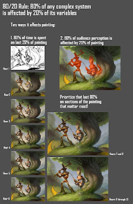
The 80/20 rule states that 80% of a system will be affected by 20% of the variables in it. So that 20% matters a lot. 80/20 doesn't mean that everything divides neatly into that ratio, or that that 80% should be one thing and 20% should be another. Instead, it's a principle of resource allocation.
 |
| The 80/20 rule applies when 80% of one thing is affected by 20% of another thing. |
So as an artist, what is that 20% of your process that takes 80% of your time or resources? There are multiple answers to this question. Here are some ways it applies to me:

How often do you get a painting to the point where it's looking good and you start feeling like you're just about done, only then you spend way more time finishing the painting up than you did getting it to that point? For me, this is true nearly every time. If you paint in detail or care about your brush strokes, this is just a fact of life.
But to make use of the 80/20 rule, you need to do more than identify the problematic 20%. It may be useful for setting proper expectations, but you won't get any faster to know that.
Where the 80/20 rule becomes useful in this case is by applying it in another related area. If I were to uniformly apply detail across this painting once I finished the block-in, it would have taken me three times as long. So instead, once I got to hour 3 or 4, I tried to identify the 20% of the painting that would likely demand 80% of a viewer's attention. Then I focused a disproportionate amount of time and effort developing those areas. The remaining 80% of the painting then fell naturally together in support of the high-attention areas. This is the magic of the 80/20 rule: tackle the correct 20%, and the other 80% often falls into place.
What are some ways that the 80/20 rule could be used to speed up your process?
Wednesday, January 25, 2012

Wednesday, January 18, 2012
Watercolor brushes
A comment in the previous post on brushes made me think I should examine the "Real Watercolor" brushes more closely, but with the proper expectations (ie. unexpected results are okay). So I did, and I didn't try anything too crazy with them, but I like them better in that context. Making multiple watercolor layers at once is nice. The watercolor eraser is awful, though. This was done for the Avalanche blog:

I still like the digital watercolors better though. This was a drawing session a week or two ago.

Monday, January 02, 2012
Brush Review 2: Painter 10, Painter 12, Photoshop CS5
I used to paint mostly with custom brushes, but my old custom brushes aren't very practical for demonstrations since they confuse new students. So when I bought Painter 12, I branched out into the stock brushes some more. Here are some of the ones I liked: some new to Painter 12, some that have been around for a while, and one or two from Photoshop.


First of all, the "Real 2b Pencil" from Painter 12. This is the only thing I use for drawing now, except occasionally the markers. Why? Because it feels exactly how you would want a digital pencil to feel. The only problem with it is the fat Wacom pen's inability to lay completely on its side like a real pencil would. But once you get used to it you'll never go back. And it's a "cover" pencil so you can draw with any color.

Painter 12 finally got markers right. I like quite a few of the new markers, but my favorite is the "Variable Chisel Tip," only I changed the Opacity control to pen pressure.

The new markers basically treat a single stroke all as wet ink, and don't layer on new color until you start a new stroke. If you've used art markers before you'll immediately feel how much better these are than Painter's old markers.
The next brush has been around in Painter for a while, but they've improved it just slightly for 12: the "Grainy Water" Blender. Something about the way it blends feels really intuitive, and best of all, if you're blending line art, you can see the original lines underneath just like you do when blending natural dry media. Lately I've been using this brush instead of an eraser when drawing, because the unique way it blends gives you a very natural feel.

The "Grainy Water Blender" makes two brushes I would have avoided before suddenly become pretty nice: The "Real Soft Chalk" and "Real Hard Pastel." The former is ideal for mixing and adding depth to your colors, the latter gives you a nice opaque color with some texture when blended.
One inherent problem with digital painting is that it will never feel as tactile and "right" as natural media. However, digital media DOES provide extra controls and options that you may not have with, say, something like watercolor or oil paint. So why did the Painter guys make their new Watercolor and Oil brushes even MORE painful and unpredictable than their real-life counterparts? I don't know, but I'm going to recommend you use some of their older brushes instead.

The watercolors Painter 10 (or 9?) introduced are mostly just useful for adding texture to your image. I really like the "Diffuse Bristle" for that very purpose. If you absolutely must use the new watercolors for actual painting, the "Wet Wash Flat" isn't horrible. But if you want something that does what I described above, in mixing some of the benefits/feel of natural media with the power and flexibility of digital, use the Digital Watercolors. In my last post on brushes I think I liked the "Simple Water" best. Well, the "New Simple Water" is even better. Digital water color is best for adding color to an existing drawing, like this:
 |
| Original drawing |
 |
| Fine details added using Real Soft Chalk and Grainy Water Blender |
My favorite part: low pressure pushes the colors around and pulls some of the color out, much like the behavior you'd get when switching between a wet brush dipped in color and a damp brush. If you want to have more than one layer of digital watercolor at a time, create a new layer and turn off "Pick Up Underlying Color" in the layers menu. If you want to dry the digital watercolor (merge colors with the canvas) for any layer, the option is in the Layers menu.
The new Oil brushes are garbage, for the same reasons I cited above: less intuitive than the real thing, and nothing new added by making it digital. Maybe a little less expensive and fewer health risks, but Corel could definitely do better than this. The biggest problem is that none of the Oil controls can be attached to pressure, pen tilt, or any other Wacom settings.

I thought I'd throw in an addendum for Painter users who are curious about Photoshop CS5, or for Photoshop users who want the same results as Painter. I'm sorry to say that for the most part, Photoshop does everything differently than Painter does. It is possible to make a Painter brush feel exactly like Photoshop, but getting Photoshop to mimic most Painter brushes is just impossible. Photoshop does a few things well, like the way it handles Dual Brush effects and texture. But its brushes don't scale well, making edges hard to manage, and its Mixer Brush Tool doesn't live up to hype. In fact, CS5's Mixer Brush reminds me a lot of Painter's Oils, and you know how I feel about those. You'll get much better behavior from modifying your smudge tool (which isn't as good as the Grainy Water Blender in Painter, but it's way better than the Mixer Brush settings for blending).
Tuesday, December 27, 2011
Class sale
I did this image as a tutorial about mixing light colors for my Schoolism class.

I also noticed that my class wasn't included on the flyer sent out by Schoolism, so I thought I'd better post something and say that the sale DOES apply to my class. The sale is $100 off self-taught classes, until Jan. 25, 2012.
Tuesday, December 06, 2011
TRUUOOOOOOWLLL!
I recently watched Troll Hunter and got inspired. I don't think a film has captured my imagination so strongly for a long while now.


Tuesday, November 29, 2011

Tuesday, November 01, 2011

Tuesday, October 04, 2011
Neversink cover
Here's another book I did art for. I did a bunch of interior art for this as well, so I might post some of it when the book comes out next year.

I was heavily inspired by the art Xiangyuan Jie did for Brother Bear, especially his painting of the glacier creeping over the mountain. It just seemed like the right feeling for the world of the book. Check out his art, he is amazing!
Monday, September 19, 2011
Stealing Apples
Done for a Friend article. I wanted to try a different render style, but looking at it now I wish I would have done something more with the drawing style as well.

Saturday, September 10, 2011
Clouds
I forgot to mention that Schoolism is having a $100 off sale on all self-taught classes for people who sign up today and tomorrow, if anyone's interested. Sorry for the late notice!
I did these clouds as a 45-minute warm-up this week, thinking I'd show some of the things I teach about atmosphere and clouds in the class. I saw this scene last year and it has stuck in my head ever since. Painting clouds can be really fun!

I did these clouds as a 45-minute warm-up this week, thinking I'd show some of the things I teach about atmosphere and clouds in the class. I saw this scene last year and it has stuck in my head ever since. Painting clouds can be really fun!

Subscribe to:
Posts (Atom)

