Monday, September 17, 2012

Squirrel Process

I had a couple people ask about my process recently, so here's a breakdown of how I paint (sometimes).  My process is usually a lot messier than this, but these are the steps I jump around between:
I often start with a rough sketch.  Adding color usually changes my feelings about the design so I like to keep things loose and change them as I go.  I put the sketch on a multiply layer at low opacity before I start painting.
I'll start most paintings with big flat colors.  I usually start by filling in the background with a color that I wouldn't mind peeking out between the strokes (because that's what it's going to do).
I usually paint in the background in that same step, but if I were more disciplined I'd paint it first behind the character.   Here I used a Darken layer on top of the squirrel layer.
At this point if I'm doing a tricky surface type like fur, I'll lay in where the major  areas of texture and value will be.  Here I also roughed in the acorn texture.
Now is my first detail pass.  Fingers, feet, and face get the most part of my attention.  I'm careful to look for things like where the skin will show, around the eyes and in the nostrils (and in a small patch in the front of the muzzle).
Now's my first pass for the lighting.  Sometimes I'll block in lighting in the first stage, but like I said, fur is a tricky thing to paint and has to be built up in layers.  I make sure that all planes facing toward the light are lit so the smaller forms don't get too broken up.
I noticed that squirrel fur is dark at the tips, so I added a soft fringe on the forms that are turning away from us.  For most of this painting I used one of two brushes---the Captured Bristle Acrylic from Painter and a modified version of that brush where I put some spacing between the bristles and turned down the "Spacing" attribute on the brush dabs so it gives a more continuous stroke.  This second one I used for most of the fur.
I wanted the eyes to look very glossy, so I put in an imaginary environment for the reflections.  Sometimes reflections have colors that aren't elsewhere in the image so I took the chance to put in a little blue to make the eyes pop.  I'm pretty sure the key light reflection is in the wrong spot, though most people won't notice.
I still felt like the fur was too flat, so I put in a 50% layer of a dark black-red.
At this point I put in the final touches: refining edges, catching textural details where important, etc.
If I have a big area that I don't want to detail out, I'll use an overlay texture to break up the area and paint in a few details to maintain consistency.  This can be hard to keep from looking cheap, but it's often worth the effort because it can save so much time.
I have a habit of painting with less saturation and contrast than I really want, so I'll make a few adjustments before I call an image done. That's it; hope it's helpful to someone!

Monday, September 10, 2012

High-res

I've had a few people ask for a high-res version of this image and I don't have a reason not to post it, so here it is.

Monday, August 27, 2012

Friend Cover for August

The Christmas lights floating in the air are supposed to drape from the title.  Now that I look back on this I wish I'd made the table and chair a lot lighter to reduce the clutter in that area.

Tuesday, August 21, 2012

Class on sale

For those people who have asked me when the next sale for my class is coming, the answer is, apparently, now.
Thanks to Kei Acedera for the beautiful promo image!

Wednesday, August 15, 2012

Color Schemes

Though the accomplished author who made fun of me in the comments for using a real word was joking, I thought I ought to do a post on triadic color schemes.
Since James Gurney has already covered this subject in great detail, rather than cover the basics again, I'll just add a few thoughts to the discussion.
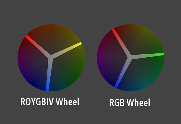
Many color schemes work just as well whether you are using the traditional color wheel (ROYGBIV) or the color wheel of light (RBG).  While the ROYGBIV wheel stretches the warm end of the spectrum, making the wheel a little more polar in its temperature, red and cyan resonate against each other as complements just as well as, and possibly more strongly than, red and green.  Same is true for magenta and green, yellow and blue (which is closer to indigo on most monitors), and so forth.
However, triadic color schemes---images using three equidistant colors from the color wheel---don't act  the same in both wheels.  This is probably because of the stretching I talked about above.
The advantage to a traditional triadic color scheme is that its even nature comes across in images using it.  It's not an exciting color combination, but the even and predictable nature of it makes it comfortable, almost friendly.
A triadic scheme from the RGB spectrum still works fine if you are just looking for interesting color combinations.  But for some reason it doesn't achieve the same effect as the ROYGBIV version.


This may not be a surprising discovery to some, but I've noticed that the farther you push a color scheme away from peak saturation and value, the more you lose the strengths of that color scheme.  However, the colors still retain a shadow of what they used to be, so even at its extremes a color scheme has a hint of the message that goes along with it.

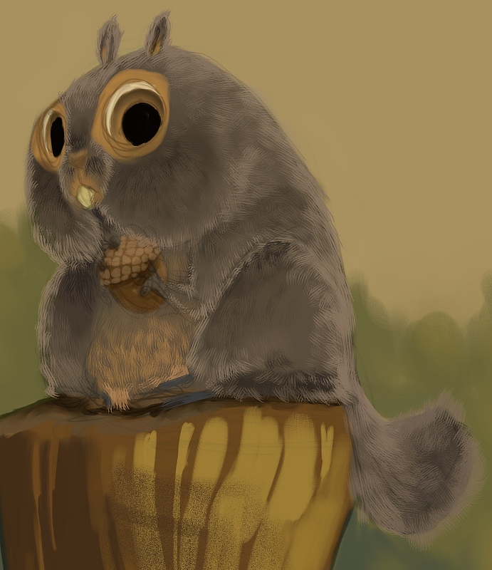
While a triadic color scheme can feel balanced, safe, and even child-like, which triad you pick for your subject matter can still strongly affect the mood of your image.  Look at the difference that happens by shifting just a little in one direction:
See how much more off-putting and aggressive the character appears in the second one?

Don't expect too much from a color scheme, though, because the color scheme is often one of the weakest factors in communicating the emotional tone of an image.  If I were to assign a priority to the effectiveness of a design element in establishing the theme, emotion, or message of an image, I'd place the priorities something like this:

(Most effective)
1. Style
2. Subject matter/content (I would include shape language here)
3. Lighting scheme
4. Value/color composition
5. Surfaces/Textures
6. Color scheme
(Least effective)

These all might switch places depending on the image, but the point is, don't count on a color scheme to solve your problems if your drawing, lighting, etc. aren't saying what they're supposed to.
If anything, the primary colors make him seem even more freaky
So think of color schemes as modifiers:  A friendly color scheme won't fundamentally change how you feel about an image, but it might layer in subtext or cast something unexpected into the tone of an image.

Wednesday, August 08, 2012

Chameleon

Trying out a triadic color scheme.  Not sure I'm 100% there with the color balance.

Wednesday, June 27, 2012

The Uncanny Valley

Most people have heard of "The Uncanny Valley" by now.  I've heard people refer to it in two contexts in the animation industry: characters that are almost lifelike but are just enough off to be creepy, and stylized/cartoon characters who have an off-putting amount of realistic detail.  I want to talk a little about the second one because I've run into it more often recently when artists have asked me for critiques.

I don't think there is a hard and fast rule for this type of uncanny valley.  When I watched The Adventures of Tintin, at first I was really bothered by the cartoon characters with realistic eyes and hands.  But by the end of the film I was engaged enough in the story that I didn't notice so much anymore.  I suspect that a lot of our reaction to the uncanny valley is a bias that can be broken down with repeated exposure.
These guys' eyes still freak me out
However, until the kids who prefer a Robert Zemeckis zombie-fest become the norm, artists who want to add realism into the animation industry are going to have to be sensitive to the issue.  Most audiences like detail and realism, so there's nothing wrong with trying to push things that way.  But how far can you go before you start alienating people?
Safely abstracted
???
Uncanny Valley
For a character with cartoon proportions, the complexity of the forms and surface details are both factors.

In my experience, the most important form details for navigating the the uncanny valley seem to be the eyes and the nose. Make the eyelids too defined, and the character will fall apart.  Visible skeletal structure on the hands and feet are a good target for abstraction as well.  Realistic forms on the ears and lips might be distracting, but don't seem to "break" the character in the same way as the other features.


Does this mean you can never define the forms around the nose?  Not necessarily.  A good rule of thumb is to ask, "Do I want people to stare at this feature?" Because people's eyes will be drawn to any unusually detailed part of a stylized character.  If the part they are staring at informs them about the character, then that can be a good thing. But if the nostrils aren't particularly important, then your design might be better off without them or at least without some of the structures surrounding them.

Even if you keep the forms simple, the texture on those forms can make a character disturbing.  Skin pores, tissue striations, and loose hairs can be particularly offensive (in this case intended for humor):
http://pixeloo.blogspot.com/2008/03/super-real-mario-world.html  Finding a more abstract version of these textures can still give you high detail without sacrificing appeal:

Of course, some of you might look at my three examples above and think that the third version is just fine, while others might feel that the middle version is already descending into the uncanny valley. What is okay depends on your audience and what you're trying to say with the style (grotesque is sometimes good).

Thursday, June 07, 2012

Comic-Con Demo

I did a demo at the LAAFA booth a couple years ago and then forgot completely about it.  I think I might finish it off but there's a lot of work outside this crop area.

Thursday, May 24, 2012

Influence map

I've seen these around before but never tried it because I didn't realize how useful and interesting an exercise it would be.
I agonized over who to leave out, and I still wonder if I should have included artists such as Dave McClellan, Joe Olson, Erwin Madrid, Marcelo Vignali, Paul Lasaine, and Paul Felix.  Those artists deserve credit in my development but I just ran out of space.

I just have to add that Alan Tew basically taught me how to draw and I owe him more than I have room on this sheet for.  Whether he takes that as a compliment will depend on how he feels about my drawing ability now. :)

The most interesting part of doing this was realizing how many good artists I'm NOT influenced by.  There are mobs of artists who I've thought for a long time are amazing, yet they have not in any way changed the way that I work or think.  This is a really strange thing that I don't understand.

And yeah, I know Bengus isn't an artist but a group of artists.  More than one of them influenced me, so I'm including them as a group.

Wednesday, May 09, 2012

Time Repairman, Progress

I'm working on a whole bunch of images but they're taking a lot longer than I'd like.  So maybe I'll just post up work-in-progress previews for now.
This one is a mash-up of a couple of inspiration images.  Can anyone guess what I was being inspired by?

Thursday, April 26, 2012

Actual stealing *UPDATED*

A while back I wrote a somewhat tongue-in-cheek post defending the practice (but not necessarily the publication) of artists imitating and leapfrogging off each other, after someone did a lousy hack-job of my art.  But I'm not going to defend this at all:
Look familiar?
I don't care whether your app is free.  Don't use someone's art without permission.

*UPDATE*:  I got a kind e-mail from the developer saying they will take care of the problem and they have already taken the app down.  I'm going to leave this post up because I was unclear in the past about how I feel about plagiarism, and I really want to stop this sort of thing from happening for artists everywhere.


Thanks to everyone for the support!

Tuesday, April 17, 2012

Neversink Tree Interior

This was one of the most difficult pieces I've ever done.  The pencil version was extremely large for one of my drawings (done on 2 11x17 sheets taped together in back), and had to have enough detail to look good even when clipped out into small sections, which is how it was used in the book.  I don't think I did a good job getting the values to feel good in the scan (it's supposed to read as a silhouette and the interior detail should be secondary), but the printers got it right in the book, so I guess that's what matters.

Saturday, March 31, 2012

Neversink interior

I'm not going to post all the interior art because I don't want to spoil things for people reading the book.  But here's one of the full-page illustrations.  I'm not a great draftsman and it's been a while since I've shaded in pencil, so making these interior illustrations was a challenge.

Monday, March 26, 2012

Pygmy Owl

Neversink is coming out this week and I just got a bunch of copies from the publisher.  It turned out really nice!
This is one of the interior spot illustrations; it turned out pretty small in the book so here's a larger look.
I'll post some more of the interior art here over the next couple of weeks, so stay tuned!

Wednesday, March 21, 2012

Work in Progress Environment

Still pushing this one around, and open to feedback if anyone sees something I should fix as I go.

Monday, March 19, 2012

My class on sale

Because I post infrequently it seems like I'm doing this often, but I put so much time into developing this class and it's one of the few things I've created that I'm truly proud of.  So I'm going to advertise it all I want, darn it!

Also, this leprechaun Bobby Chiu designed is creepy cute, and I like it.

Thursday, March 15, 2012

Worf Hulk

Something for the Avalanche blog topic.  I didn't think I was that excited about the Avengers movie, but I've been having dreams about it lately, so I guess I am.  That, and lengthy videos with Worf's pent-up frustration and his apparent inability to do anything about it inspired this:

Wednesday, March 07, 2012

Air Scooter

I started this back in November, which is why it has an autumn theme.  Thanks to Ben Simonsen for the helpful paint-over suggestions.

Friday, February 24, 2012

Meeting sketches

I don't always sketch in meetings, but when I do, I sketch strange-looking people.

Monday, February 20, 2012

Teaching fun

One of the pleasures of teaching for Schoolism is that the school brings in people from all over the world and all levels of the art industry.  Many of my students are more skilled/talented than I am, and half of them already had impressive jobs in the industry, but took the class because they wanted to fill out one corner of their expertise a bit.  I love teaching, and helping anyone learn is rewarding.  But it's especially fun when an artist gets exactly what you're trying to say, and pulls off something amazing or unexpected with the limited criteria of an assignment.
Here are some of the highlights from the final assignment of last semester.  I gave the students line art and a lot of freedom with the lighting scheme, render style, surfaces, etc.:

by Dane Madgwick


by Colin Foran


By Claire Hummel


By Stijn Van Doorselaere

I've also had some impressive students in the self-taught class.  I don't get to interact with them as often, but I still enjoy seeing what they do and how they react to the lessons.  An artist named Johan Törnlund wrote a thoughtful review (with some criticism also, which is nice because now I can address those problems), herehttp://feedchicken.blogspot.com/2012/01/schoolism-review.html

Wednesday, February 15, 2012

The 80/20 Rule

I've often heard artists, designers, management, etc. use "the 80/20 rule" to explain their choices.

"You want 80% to be rest areas and 20% areas of detail"
"80% of this geometry should be interactive and 20% non-interactive"
"As long as we get it 80% right, the extra 20% doesn't matter"

The problem is, none of these things have anything to do with the 80/20 rule.  So let's get it right, because this is an important one if you want be a faster artist.
The 80/20 rule states that 80% of a system will be affected by 20% of the variables in it.  So that 20% matters a lot.  80/20 doesn't mean that everything divides neatly into that ratio, or that that 80% should be one thing and 20% should be another.  Instead, it's a principle of resource allocation.
The 80/20 rule applies when 80% of one thing is affected by 20% of another thing.
So as an artist, what is that 20% of your process that takes 80% of your time or resources?  There are multiple answers to this question.  Here are some ways it applies to me:
How often do you get a painting to the point where it's looking good and you start feeling like you're just about done, only then you spend way more time finishing the painting up than you did getting it to that point?  For me, this is true nearly every time.  If you paint in detail or care about your brush strokes, this is just a fact of life.
But to make use of the 80/20 rule, you need to do more than identify the problematic 20%. It may be useful for setting proper expectations, but you won't get any faster to know that.

Where the 80/20 rule becomes useful in this case is by applying it in another related area.  If I were to uniformly apply detail across this painting once I finished the block-in, it would have taken me three times as long.  So instead, once I got to hour 3 or 4, I tried to identify the 20% of the painting that would likely demand 80% of a viewer's attention.  Then I focused a disproportionate amount of time and effort developing those areas. The remaining 80% of the painting then fell naturally together in support of the high-attention areas.  This is the magic of the 80/20 rule: tackle the correct 20%, and the other 80% often falls into place.

What are some ways that the 80/20 rule could be used to speed up your process?